Welcome back! If you haven’t read part 1 of this article you can click here to get the insight and not miss a thing! In this part, I’ll focus on the key elements of decorating that are frequently left out and most importantly, how to avoid them by following an easy step process.
Ready to learn more? Alright then!
This blog post contains affiliate links. If you purchase from me, I may earn a small commission at no extra cost to you. Thank you for your support.
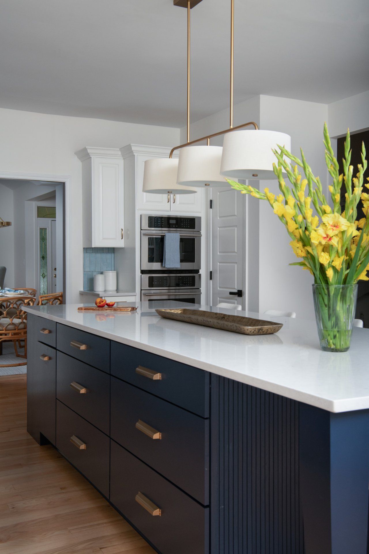
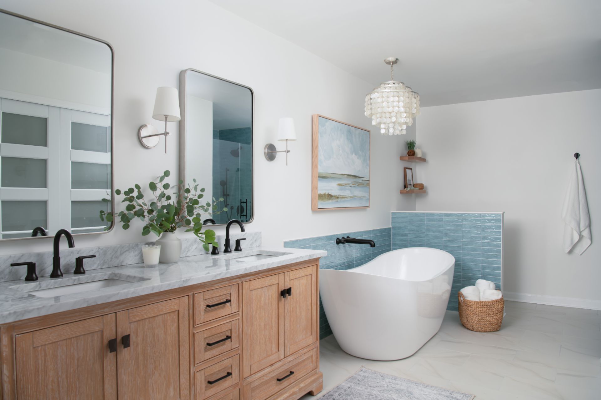
#6 Insufficient lighting

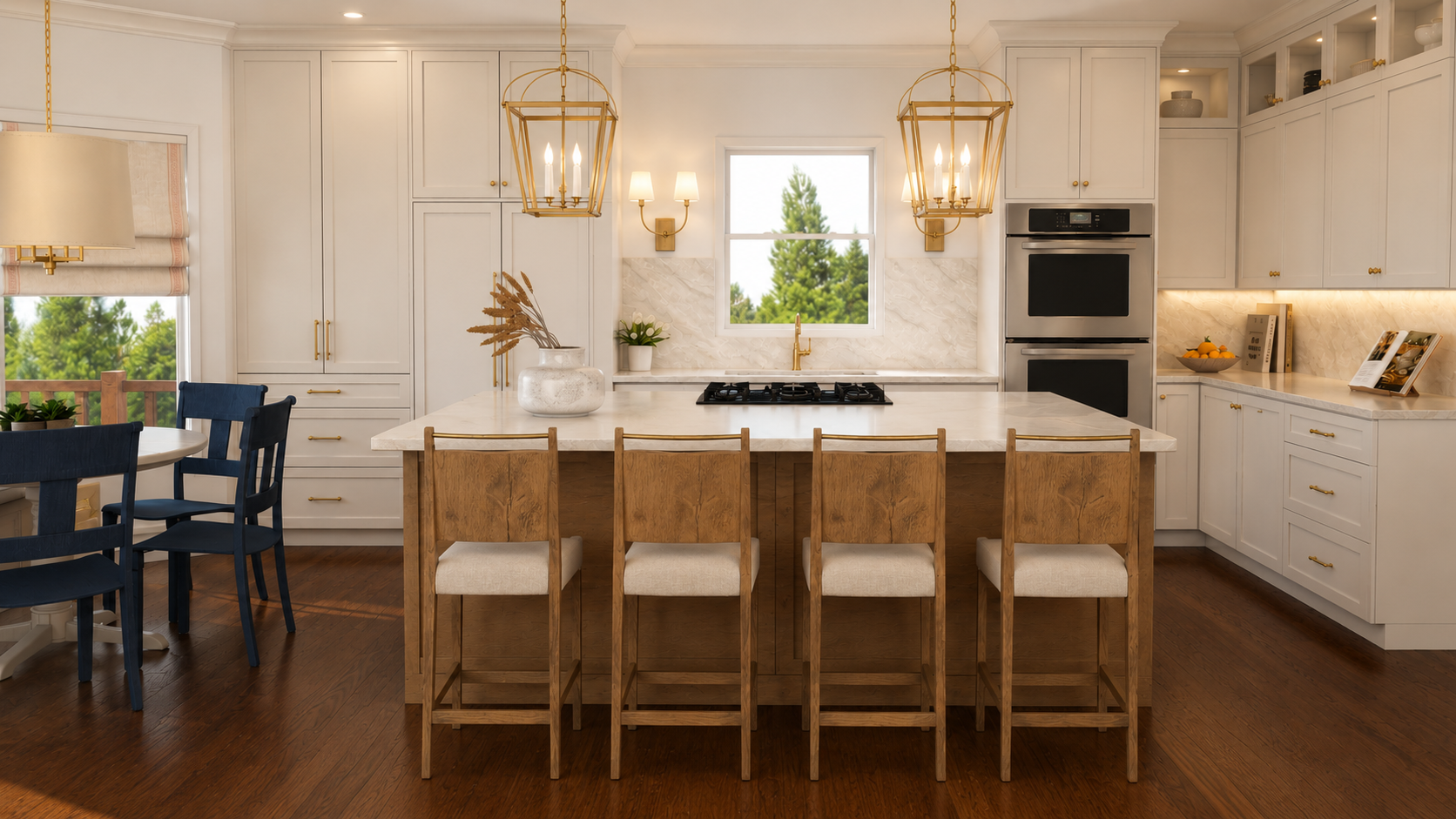
There’s nothing worse than walking into a room and having your mood flip like a switch. This is because lighting is one of the most important elements to consider when decorating your room. Not having enough lighting will cause your room to look smaller and cramped.
While there’s nothing better than natural light,
it’s always good to consider incorporating extra lighting in your room. These can include ceiling fixtures, lamps, and some accent lighting like sconces. The good thing about lighting is that there are lots of varieties that you can include in your space.
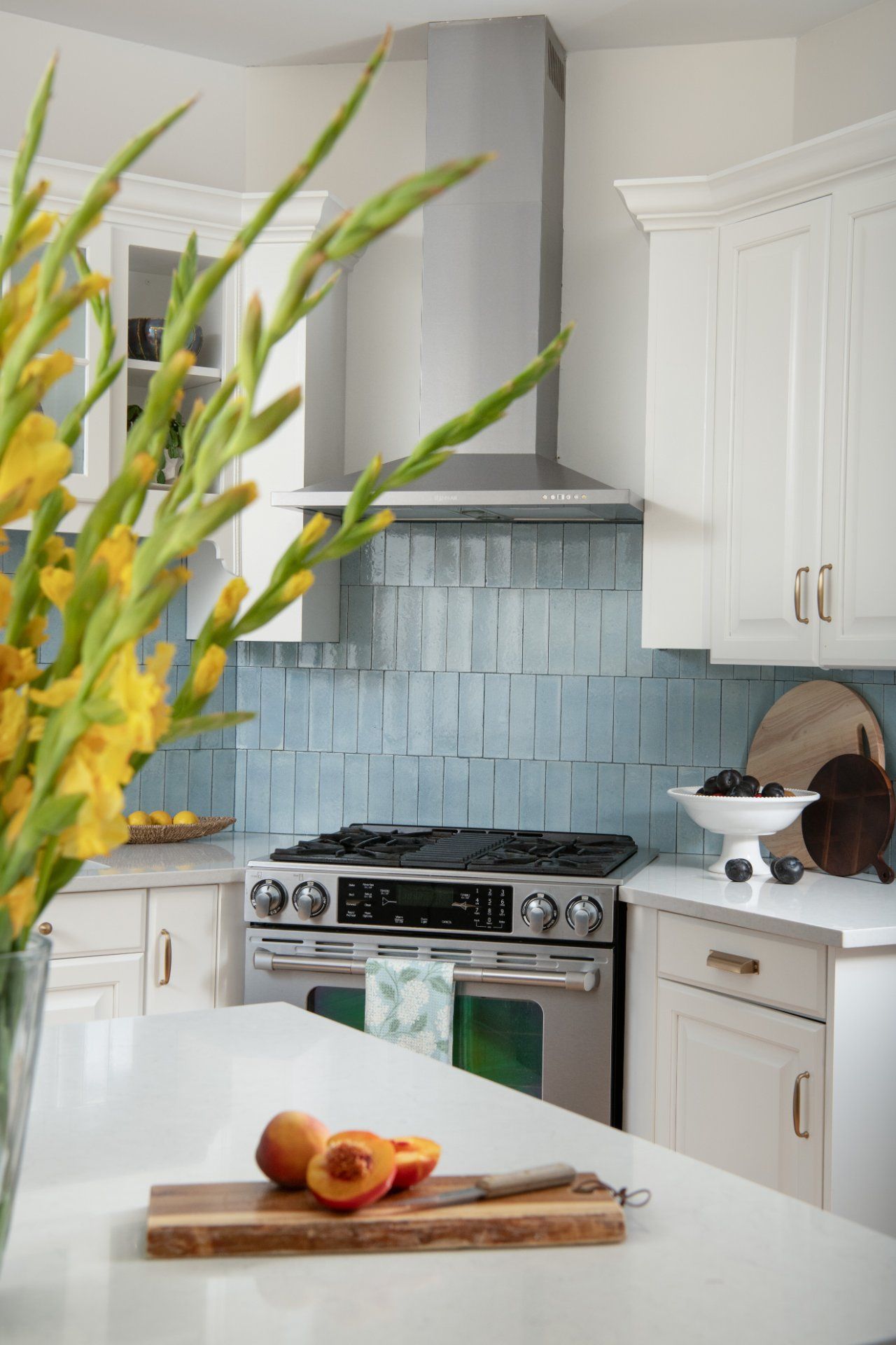
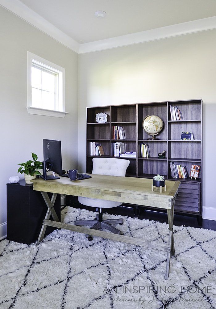
Take a look at this example below, and see how it illuminates the center of the kitchen and immediately draws attention to the island, making it the centerpiece of the room.
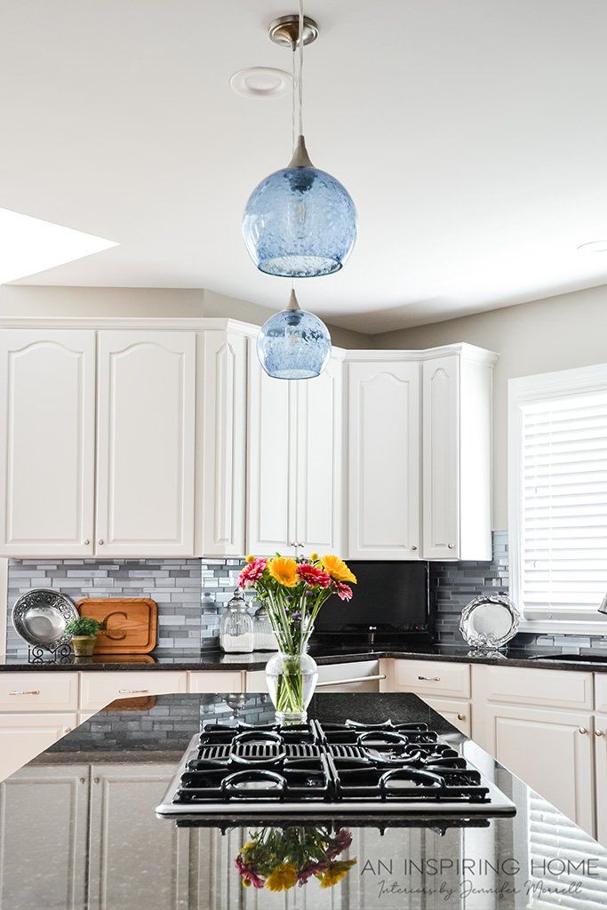
Love the idea? Create a similar look in your kitchen with these:

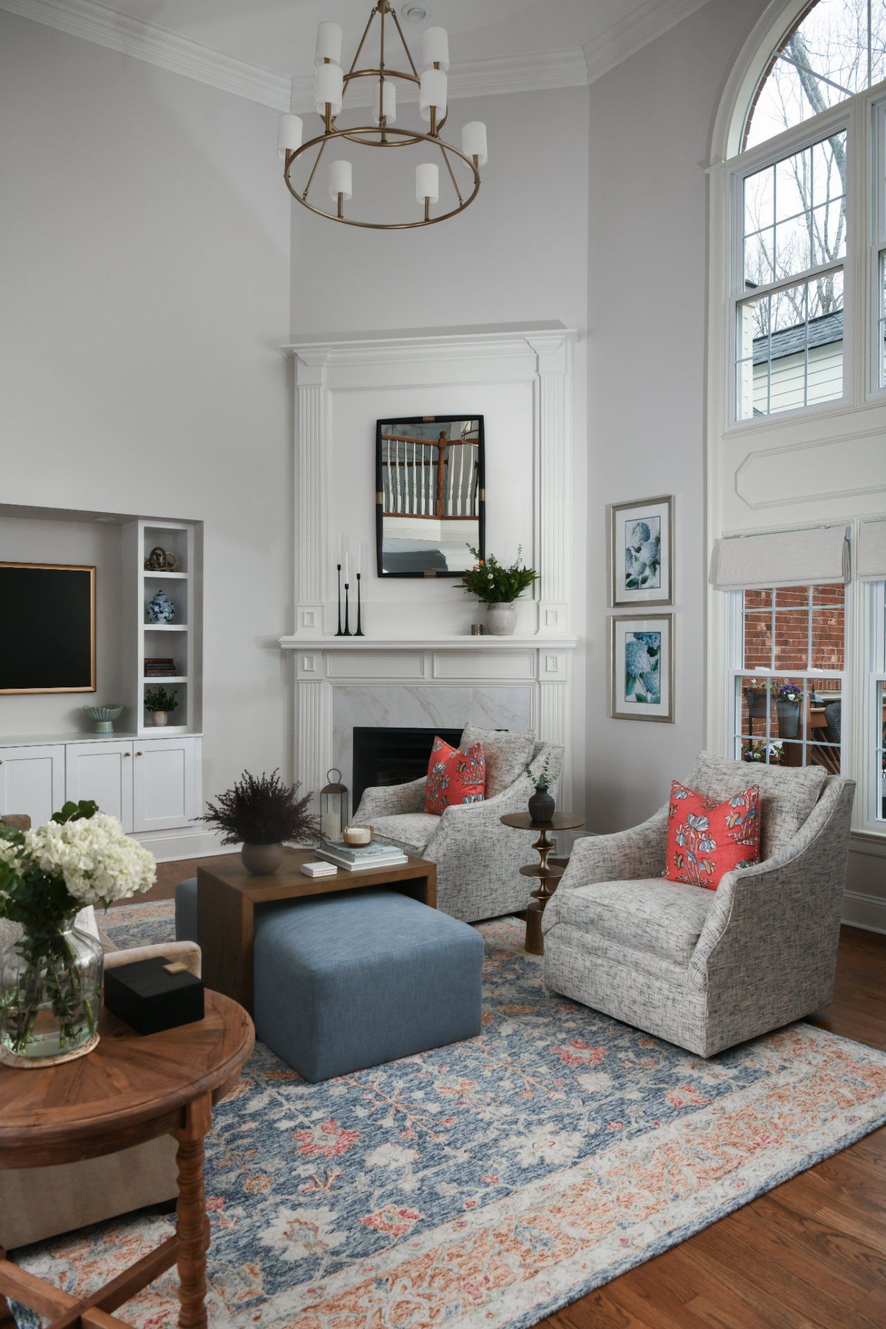
#7 Not having enough contrast
Not everything needs to be the same color or the same texture, as this will make our rooms look and feel boring. My advice here is to use a variety and try to include elements that even though are different, merge well together. There are several ways to add contrast to your rooms:
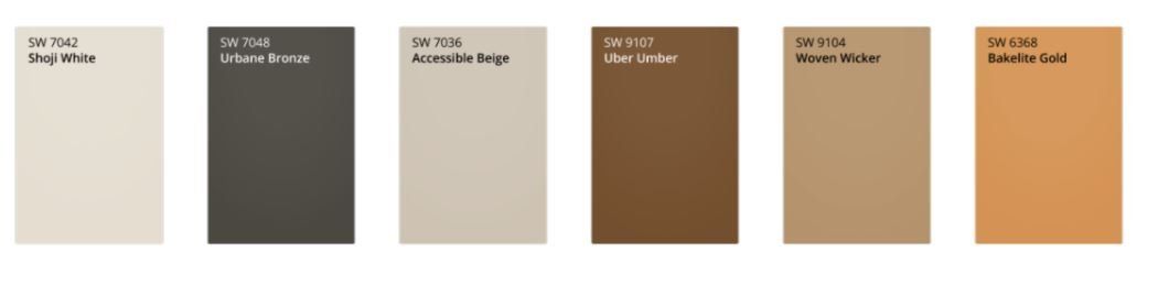
- Contrast using color: this can be achieved by using a dominant color and a soft one. The best example here is black and white, but you can also choose to include those that are opposites. Take a look at this palette from
the 2022 color of the year, you can choose a strong color like the Urban Bronze or Uber Umber and mix it with an Accessible Beige or a Shoji White.
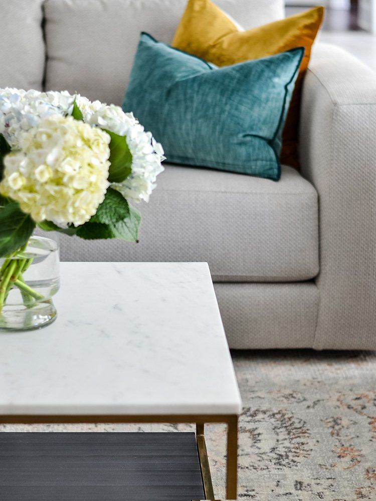
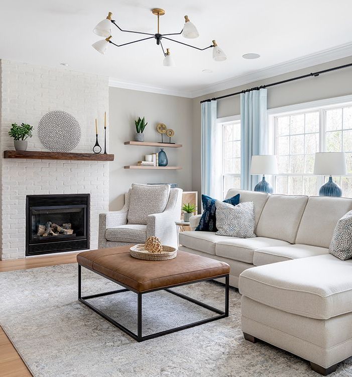
- Contrast using texture: Adding two different textures will make your room look more appealing to the eye. Using a similar principle as above, I recommend going with a rough and smooth texture. Placing them together will create a good contrast. Take a look at this example below:
- Contrast using different materials: This may be something that you’re already doing in your room, by having wood, plastic, stone, or metallic materials. When combined properly, they bring a whole new life to a room. The key here is to not overwhelm your space and instead focus on two or three mainly.
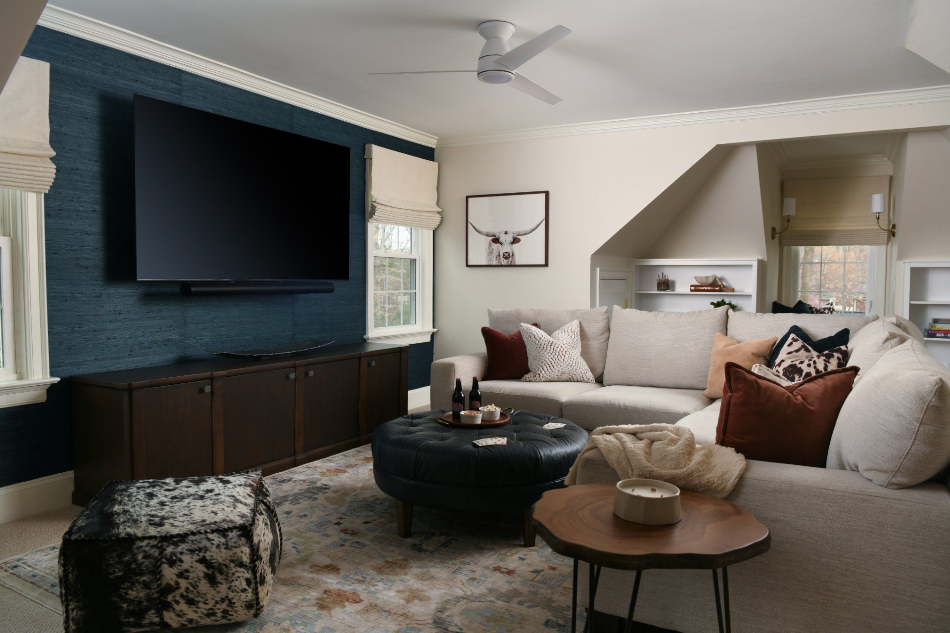
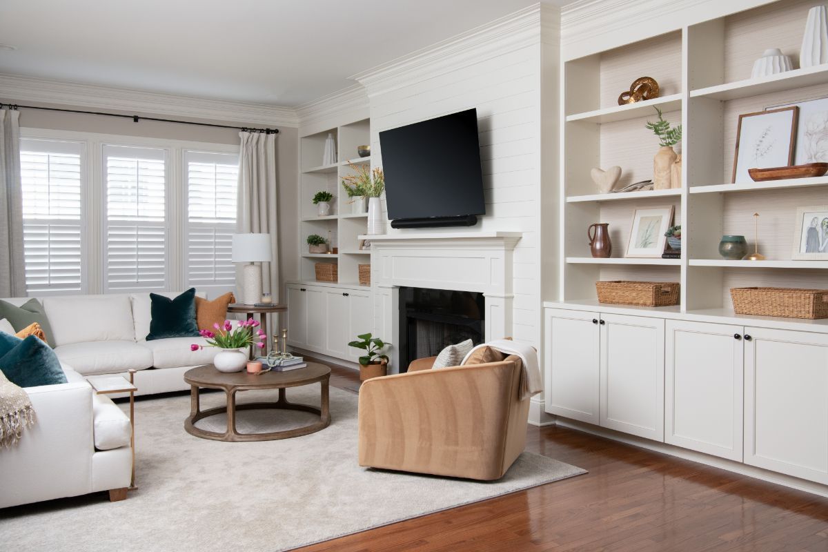
#8 Lack of art and accessories
Another common decorating mistake. Not including these two elements will make your room feel empty and lonely. Art and accessories are like the jewel pieces of your room, they just add that final touch. With art, most people fear that it will not match well with the room or won’t deliver the desired effect. To solve this problem, make sure to check out this previous article, where I share tips on how to display art in your home.
When it comes to accessories, I would say mix and match. Try different textures, sizes, colors, shapes, and make sure to follow this guideline.
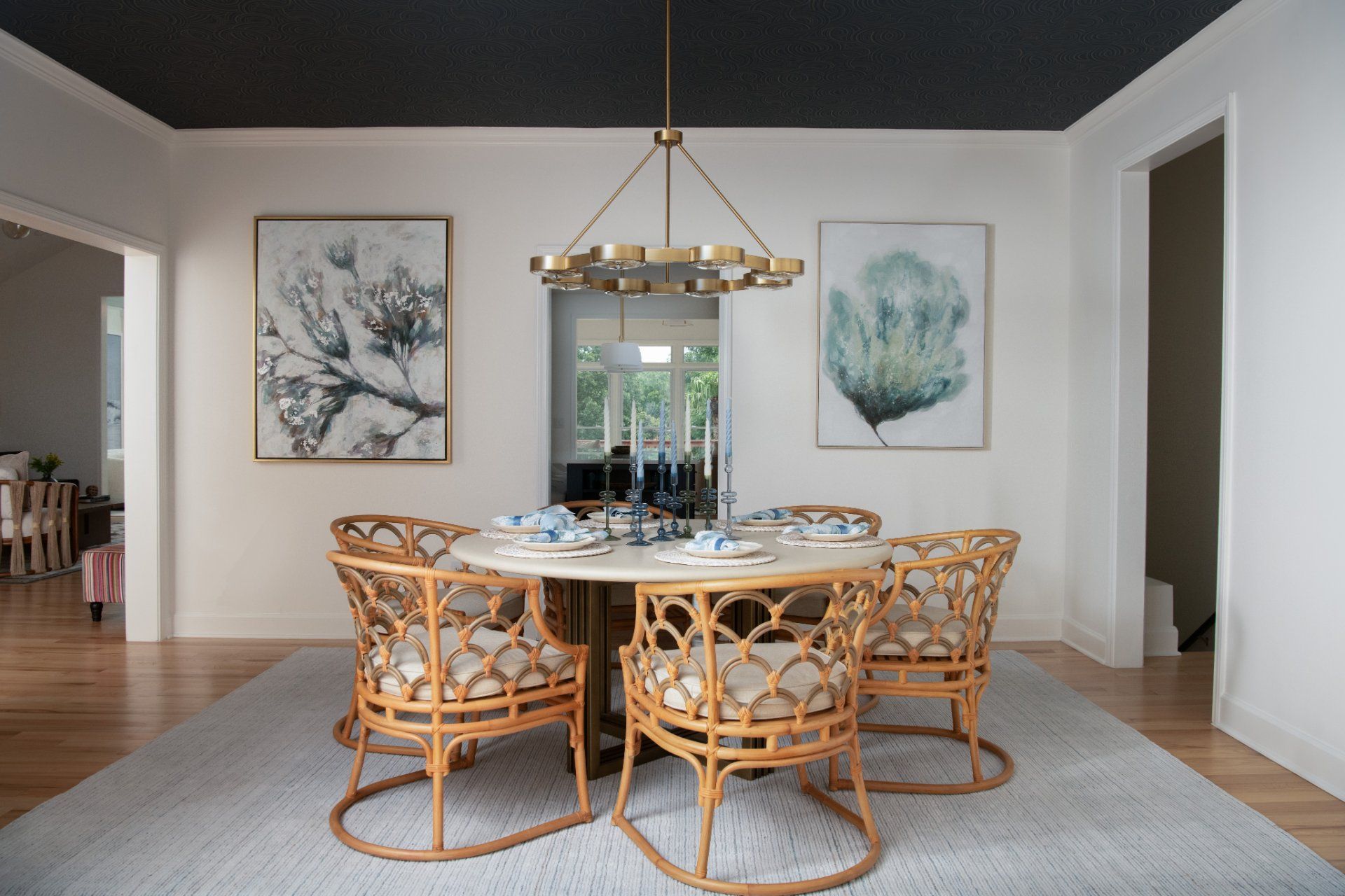
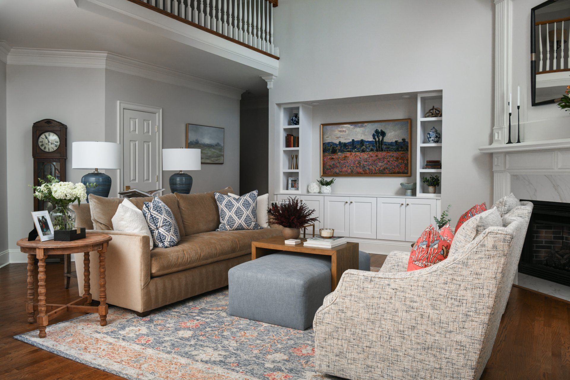
#9 Lining furniture to the walls
When you have a large space, one common mistake is to line your furniture to the wall, since that seems obvious. However, by doing this, the room will feel smaller and cramped. We also want to use the furniture to create an intimate conversation area.
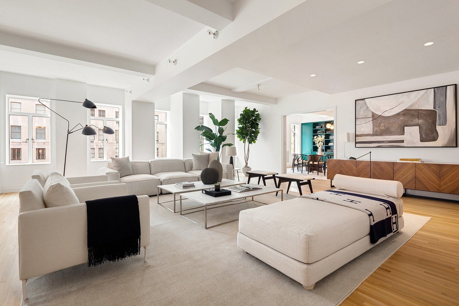
A great way to make the most of your living or family room is to place your furniture in a “floating way” or “floating” furniture”. This means placing your furniture in the center of a room, leaving a foot or so of space between them and the walls,
that way you can expand the space around it and create a more intimate and cozy feeling.
#10 Adding too many colors
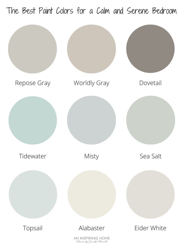
I know we spoke about colors and contrast, and their relevance to a space. But we don’t want to get too excited about adding too many colors to a room. This will not be appealing to the eye and will transmit a wrong mood. The key here is to find the right palette that matches well with the room personality, that way you may use colors that merge and contrast well with each other. In this article, I shared with you an example of how to apply the right color palette to your room.
This part may be tricky, but it’s one of my favorite things to do, so make sure to book a call with me here so I can help you!
And there you have it, 5 extra decorating mistakes and how to avoid them. Let me know in the comments which ones you found most helpful. I’d love to hear your feedback.
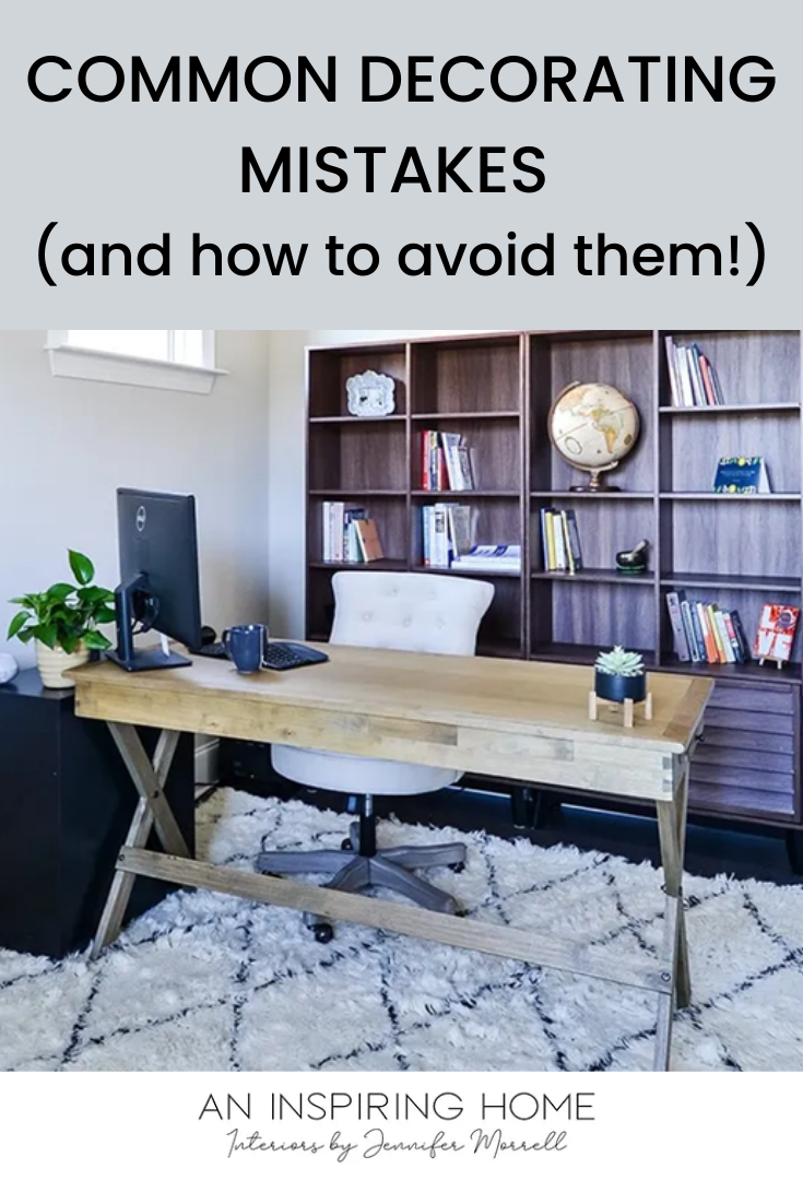
pin it here!
What’s your design style?
Find out what kind of interior design best suits your inner self. From Transitional to Modern, it's time to make your home a place you’ll love!
You can opt-out at any time. Please note we do not share your information with anyone.

I work with busy families to create beautiful and functional spaces by providing local design services in the Charlotte/Waxhaw area and beyond through online design.

What’s your design style?
Find out what kind of interior design best suits your inner self. From Transitional to Modern, it's time to make your home a place you’ll love!
You can opt-out at any time. Please note we do not share your information with anyone.

Recent Posts