Tailored. Transitional. Timeless. This year's color selections reflect warmth, comfort and sophistication. If you like shades that feel fresh and modern, you will love Sherwin William's and Benjamin Moore's picks for 2026. In this blog post, I'm analyzing both colors with designer-approved combinations to help you incorporate them in your home in a way that feels intentional, comfortable, and uniquely yours.
Before jumping in, I recommend you takeour design style quiz. It’s the best tool to help you understand your preferences and is a vital first step to having a home you love.
Meet the 2026 Color of the Year
In 2026, interior design is shifting towards intentionally, thoughtfully designed rooms rather than chasing trends. The color palettes reflect this change by bringing a sense of quiet luxury to our homes.
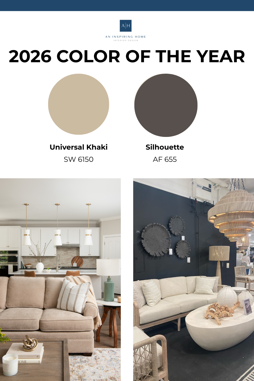
This is why Sherwin-Williams has chosen Universal Khaki SW 6150 as this year's color, a mid-tone neutral that emphasizes timeless functionality, nature-inspired warmth, and layered elegance.
In line with this theme of elegance, Benjamin Moore's unique color, Silhouette AF-655, is a luxurious choice. It features subtle notes of charcoal, emphasizing style and grace while making a bold statement in any room.
Although different, both colors reflect elegance, timeless design, and tranquility, helping create a personal sanctuary in your home.
Let's explore each color, its key characteristics, and complementary shades you can use in your home this year.
Sherwin-Williams Universal Khaki SW 6150
Khaki is known as a universal color. From fashion to design,
it’s known for its classic touch and versatility. This year, the goal behind this pick was the opportunity to demonstrate that true design is classic, bringing to life one of my favorite mottos,
less is more.
Featuring a minimalist look, this color creates opportunities to complement with other tones to elevate your space, such as:
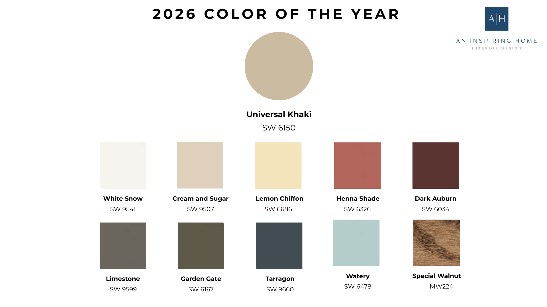
The first thing we can see is a mix of earthy and warm tones that enhance the khaki.
In our designs, we haven’t used this exact color, but we love to start with a neutral base, such as this year's color, and add pops of other colors or textures that bring a space to life.
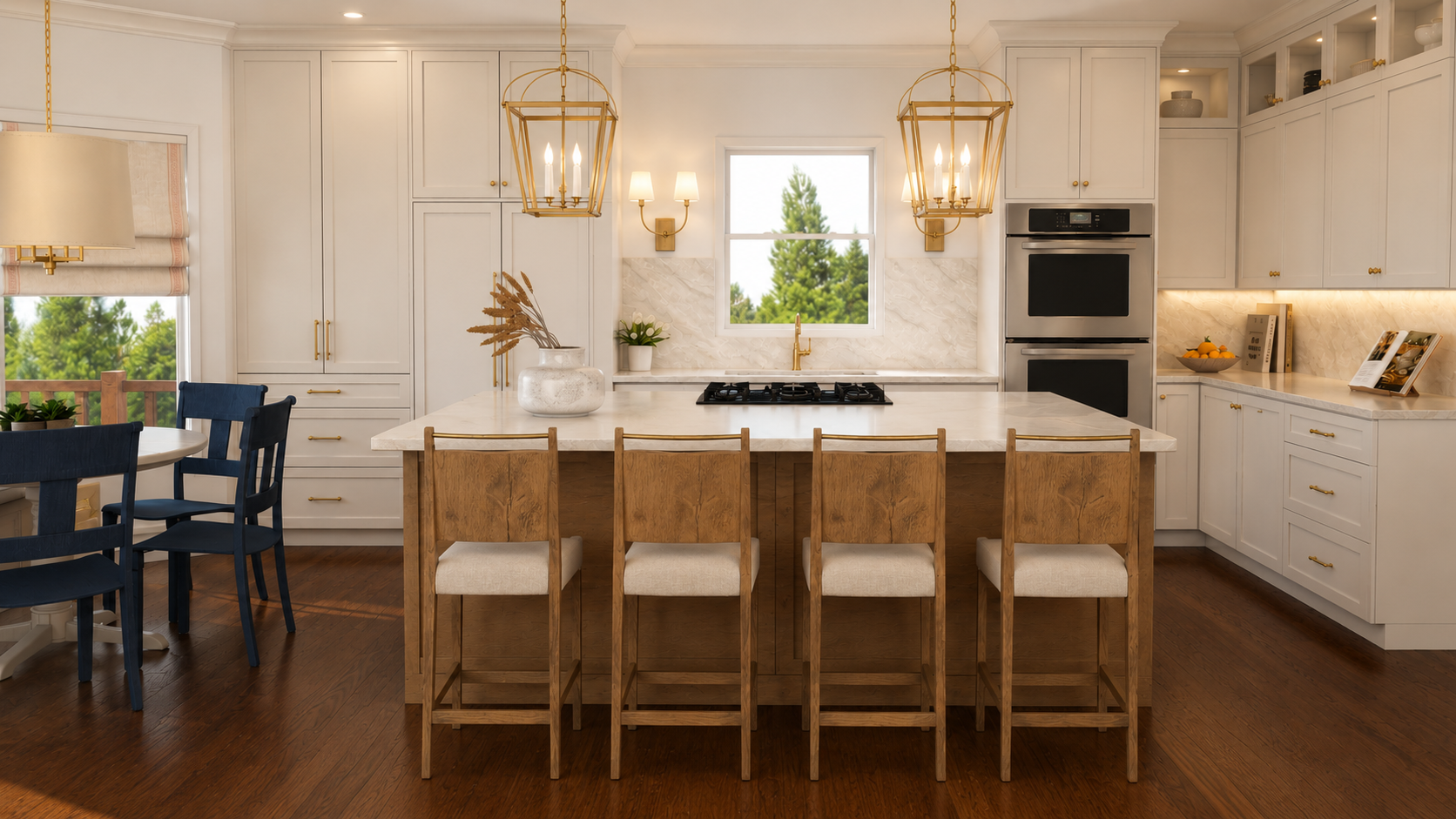
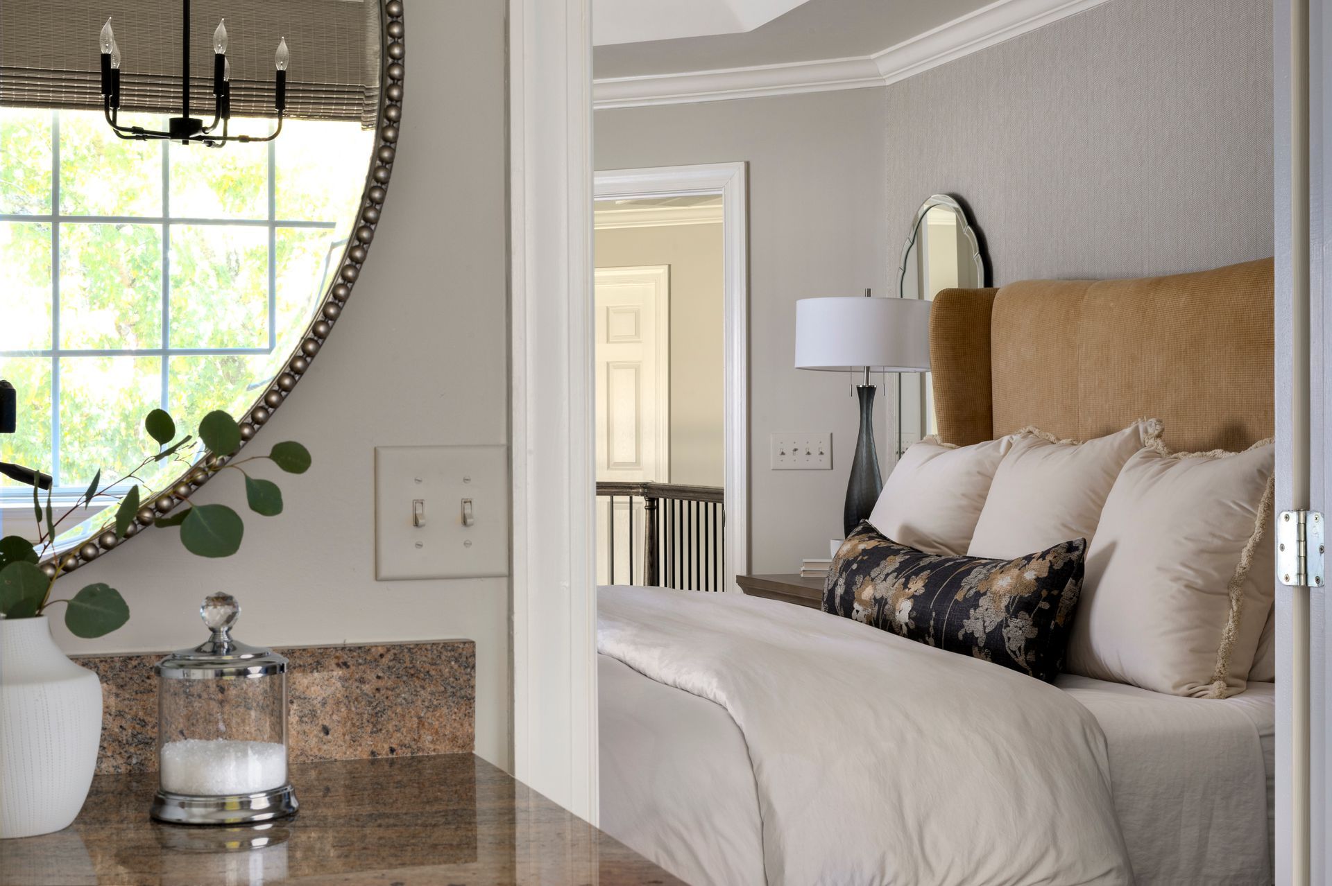
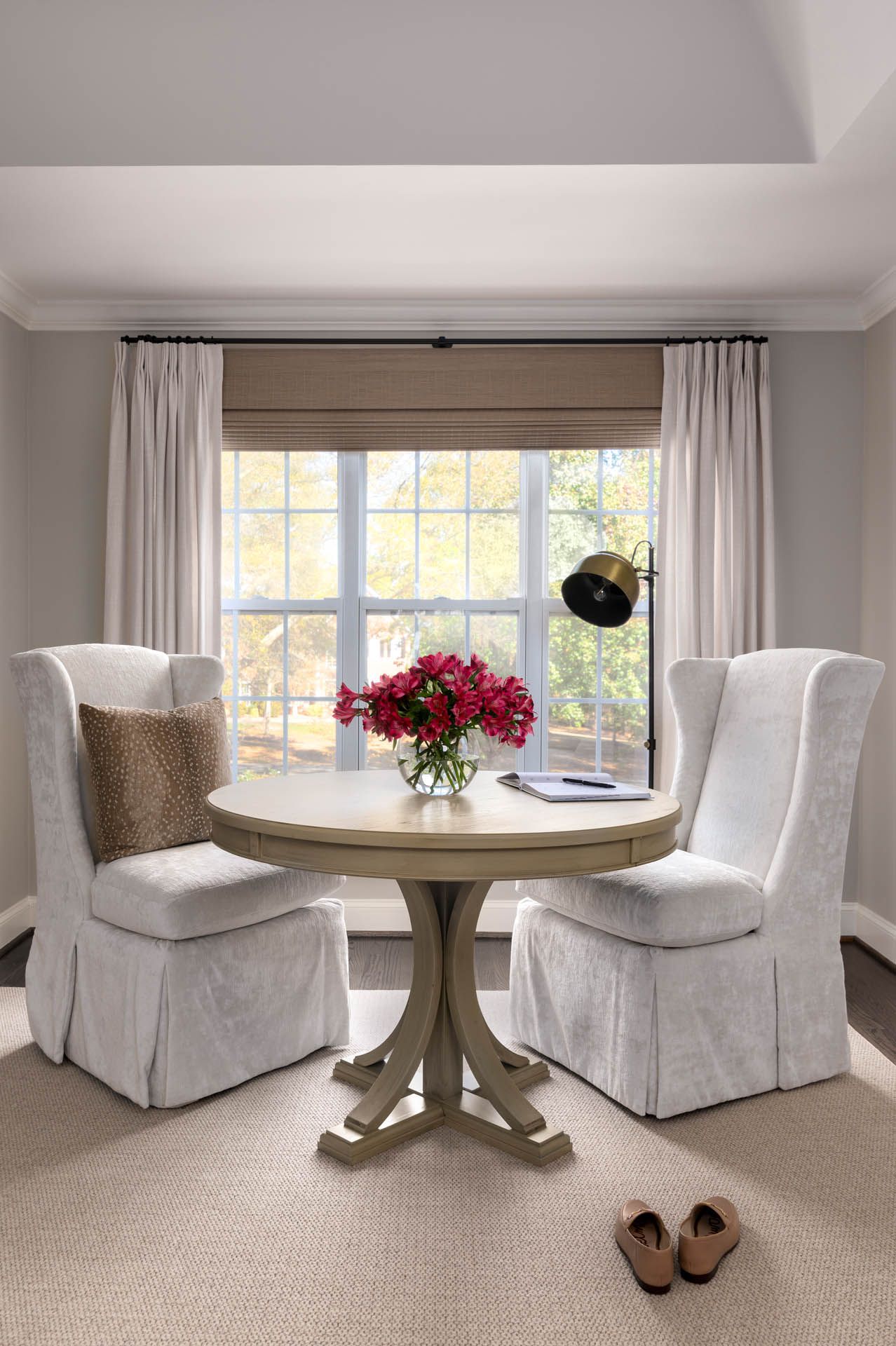
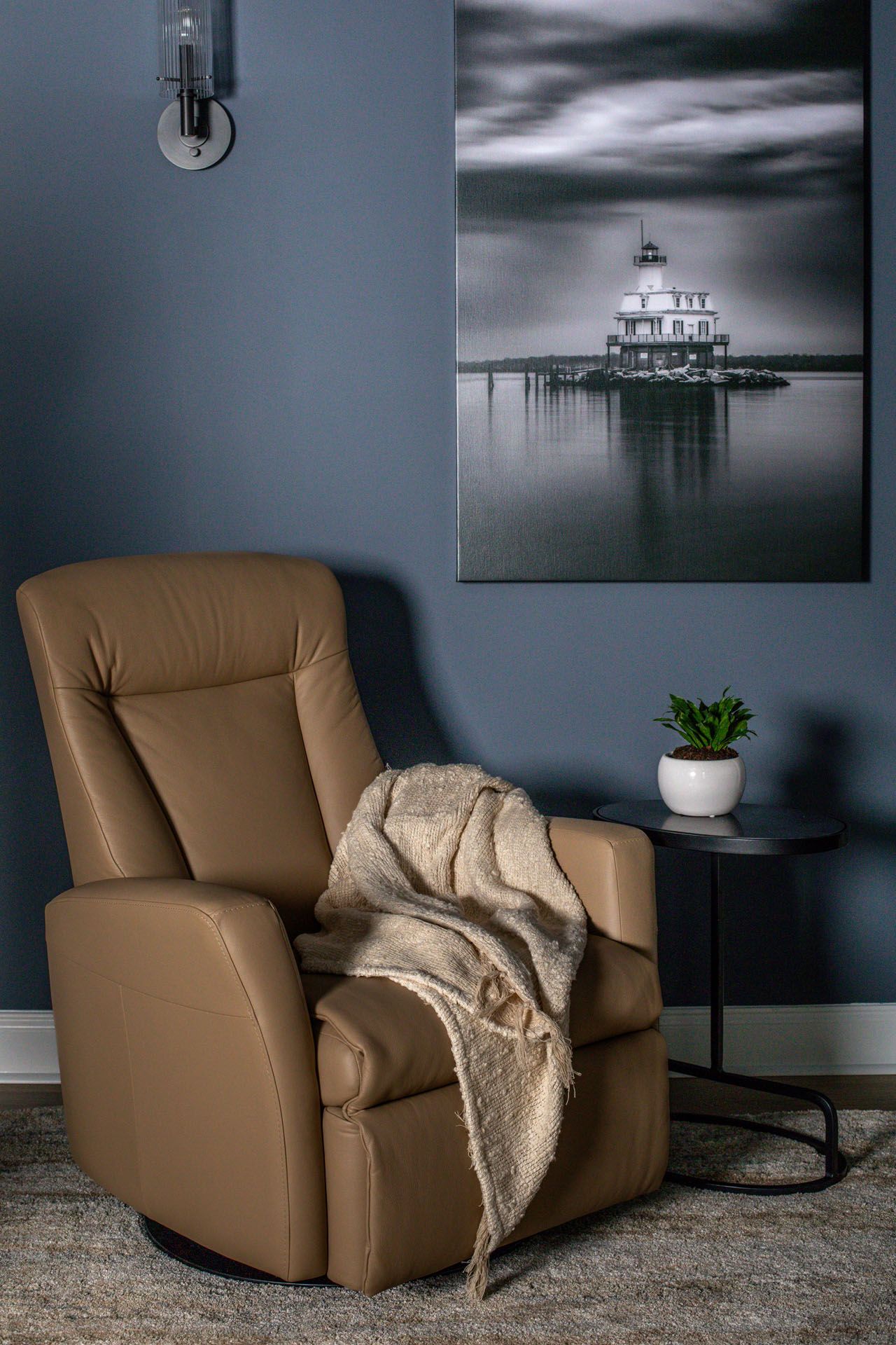
For example, in our
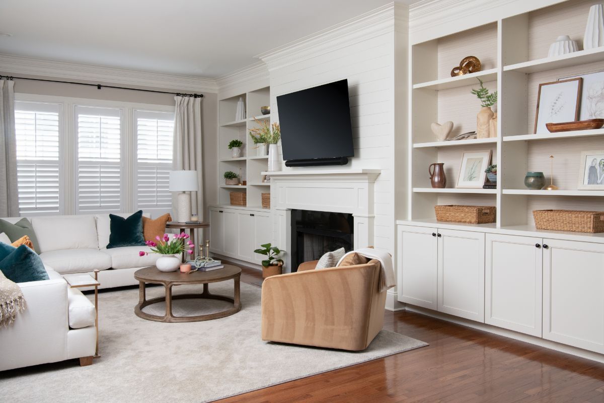
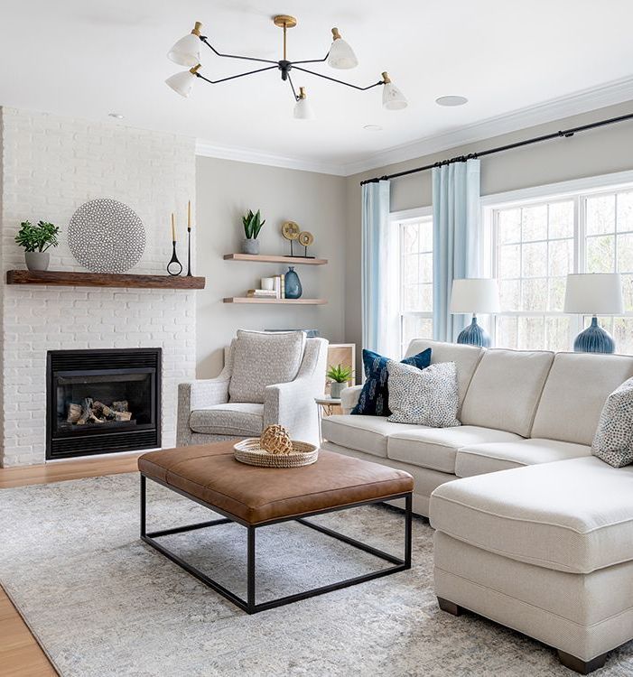
Warm and Timeless Traditional Project, our goal was to create a cozy bedroom, which we achieved by incorporating neutral design elements. In this reading nook, we used cream and khaki tones to create a timeless design. We love to add pops of color in small details, such as the deep brass floor lamp and the animal print pillow.
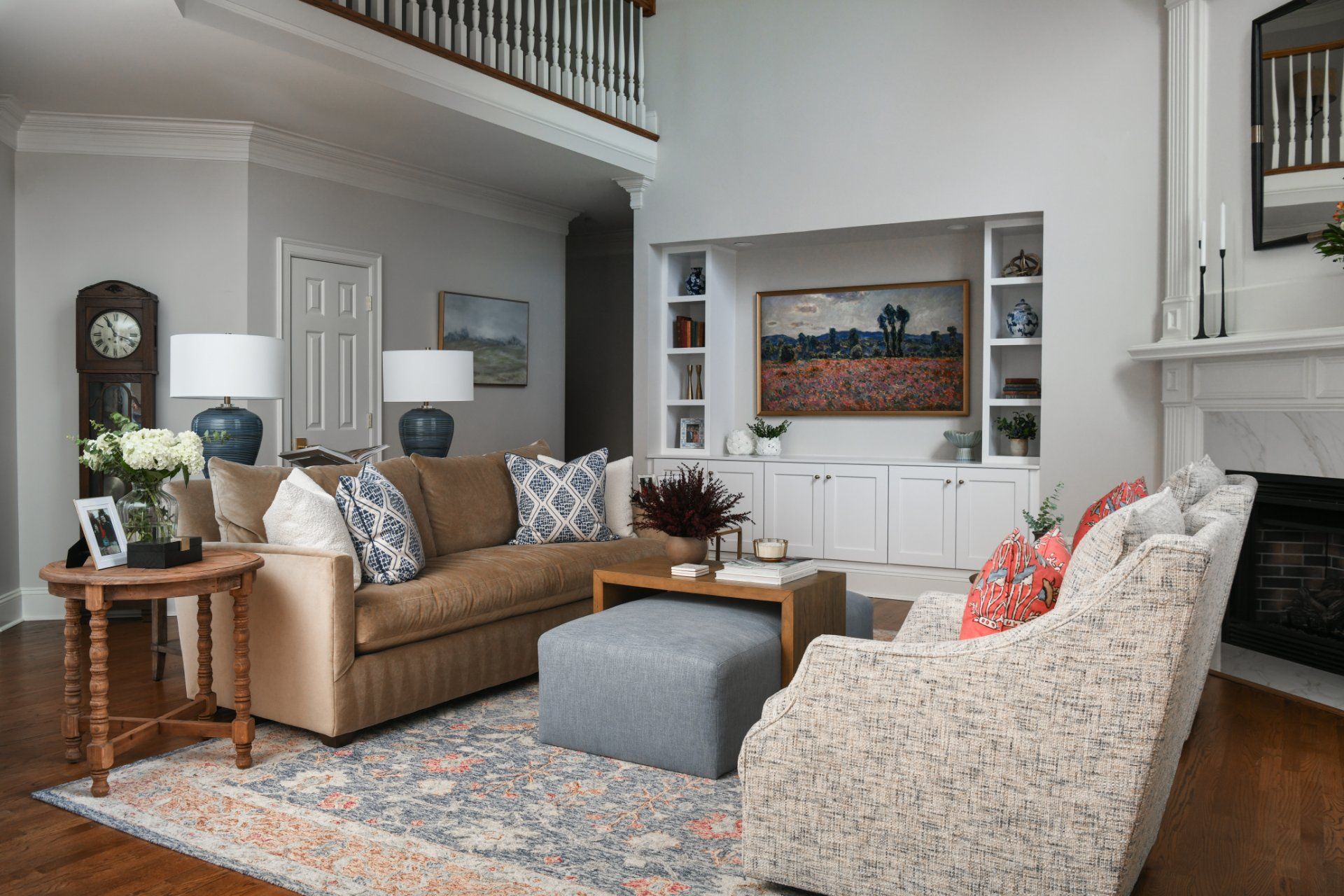
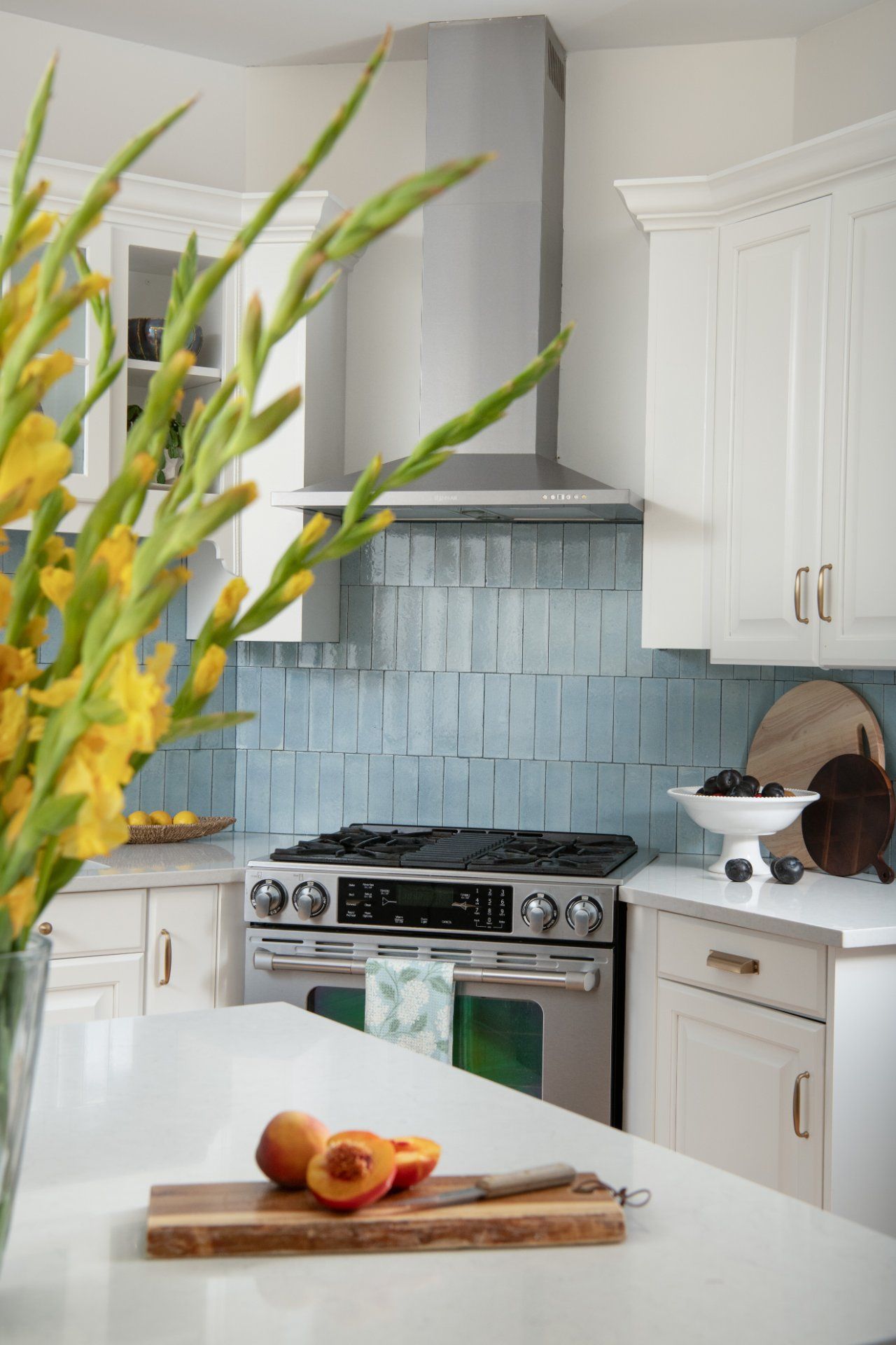
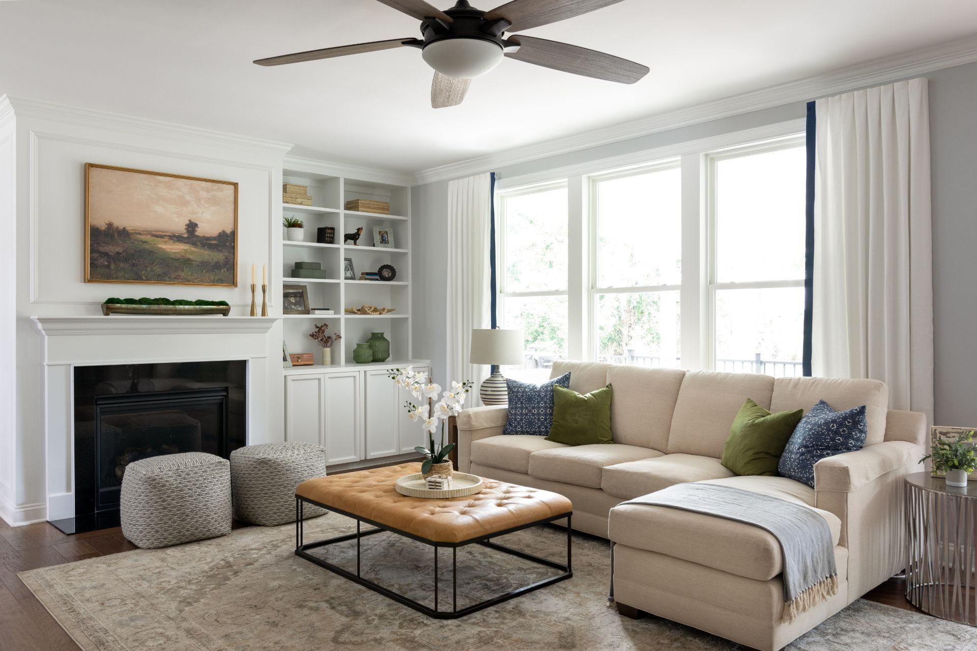
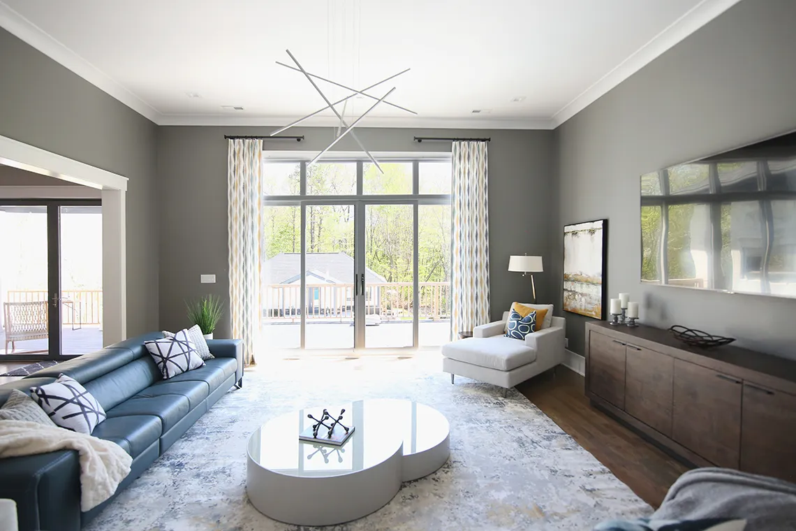
Another example is our
Refined Casual Living Project, where we used a custom neutral sofa as a starting point and added pops of color throughout the design, including pillows and decor.
Benjamin Moore Silhouette AF-655
As a contrast to the timeless khaki, Benjamin Moore's presents us with AF-655 silhouette, a bold reminder of tailored suiting. This elegant color combines rich espresso hues with refined charcoal undertones. It is the perfect tone to create a statement.
While it may seem strong at the beginning,
it is like a good espresso: rich, intense, and achieving just the proper harmony of its elements. You can use this color on walls, ceilings, and doors to create an elegant, elevated look.
Similar to Universal Khaki, this color complements the following palette:
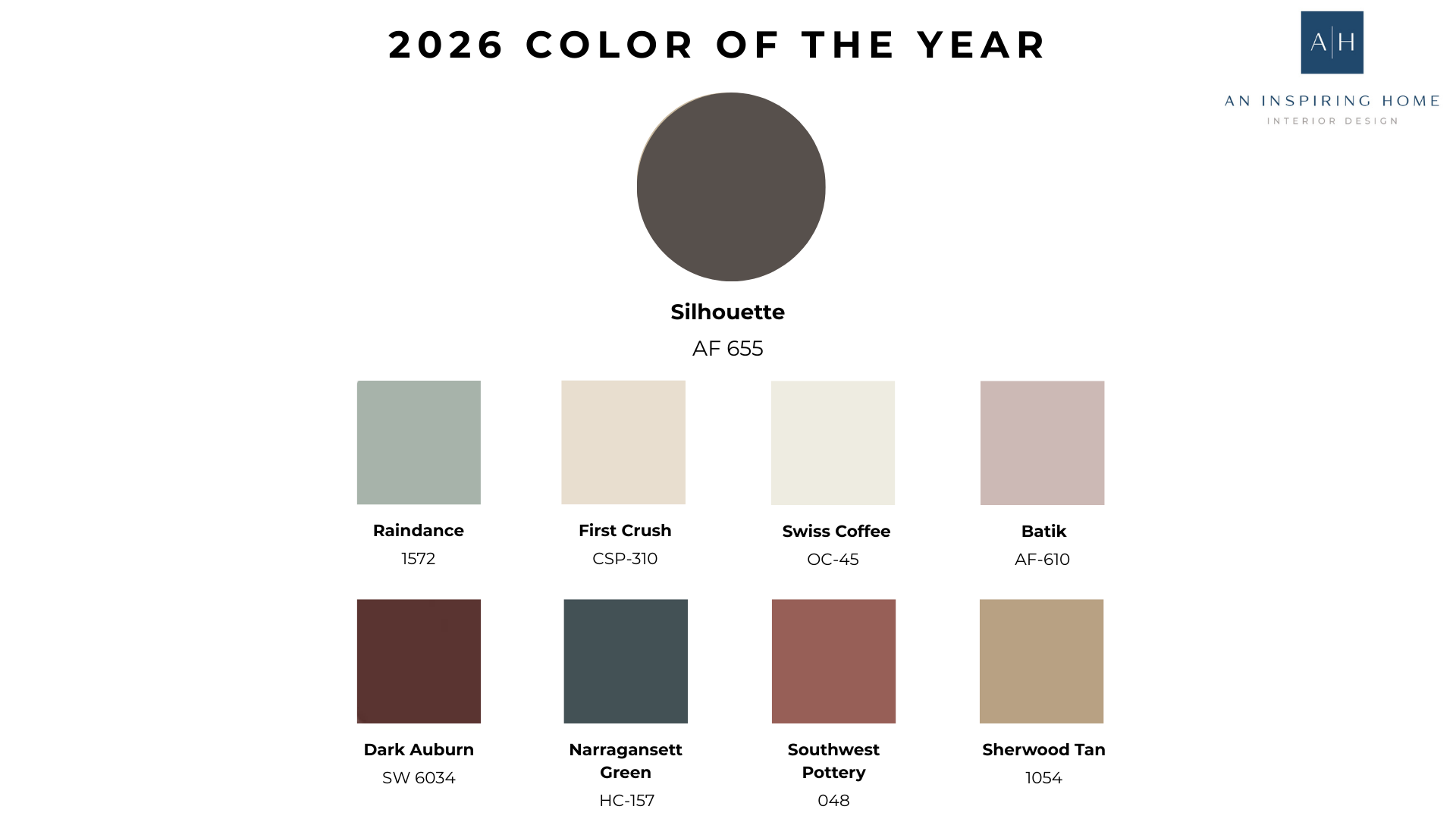
We see a mix of neutrals and earthy hues, with blush tones that soften and contrast the rest. I love having both extremes, the bold, accent hues, and the pastels that provide just the right balance.
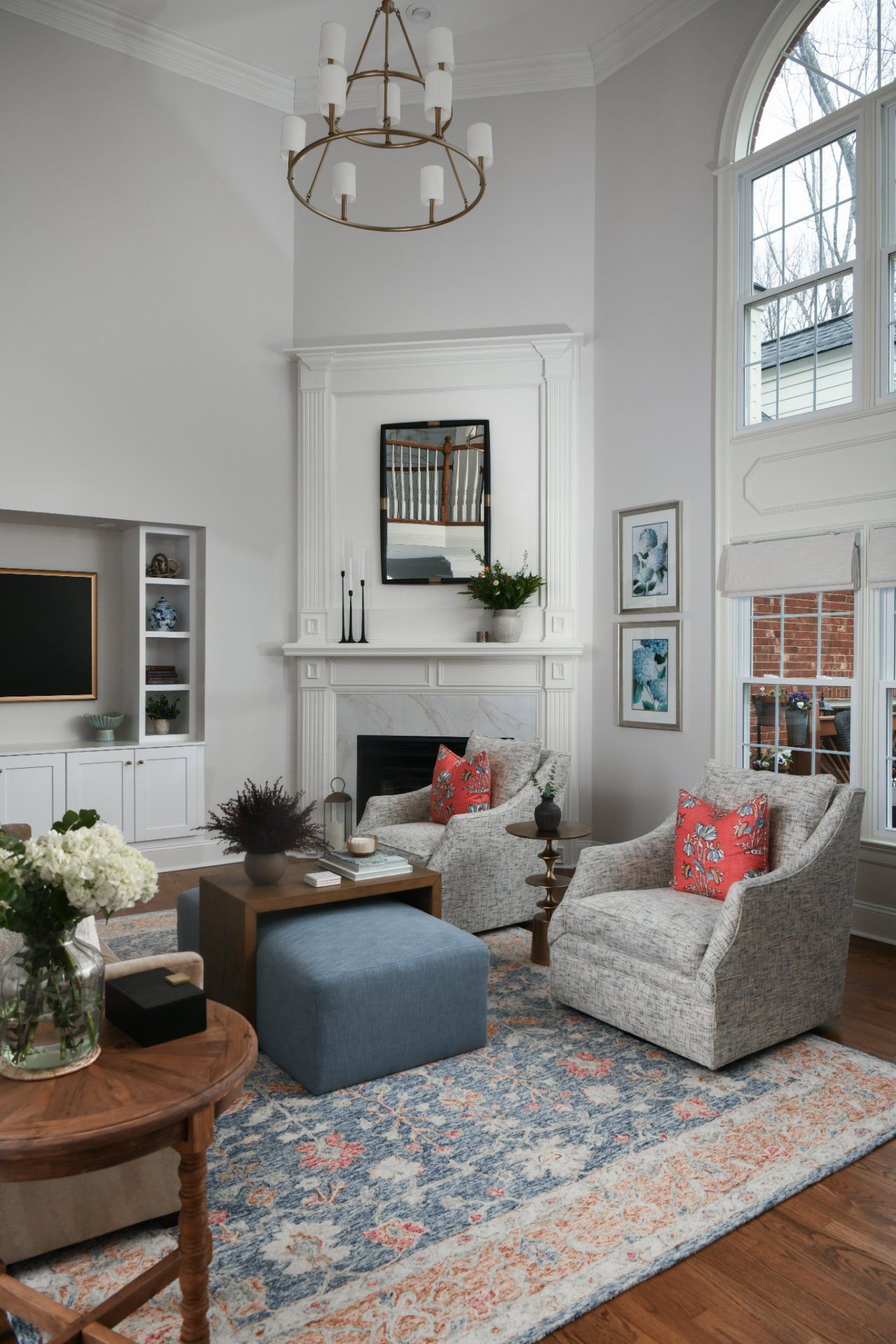
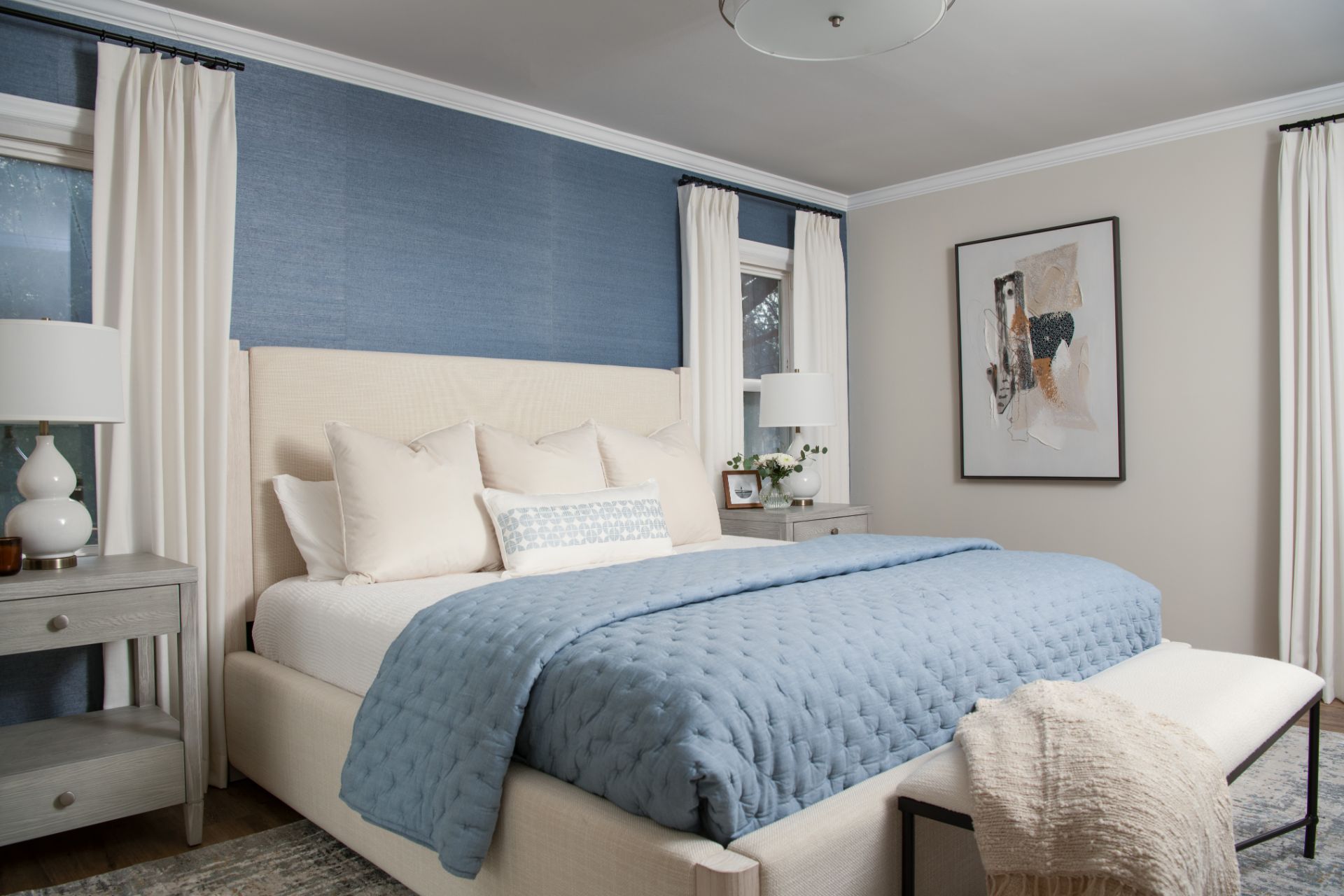
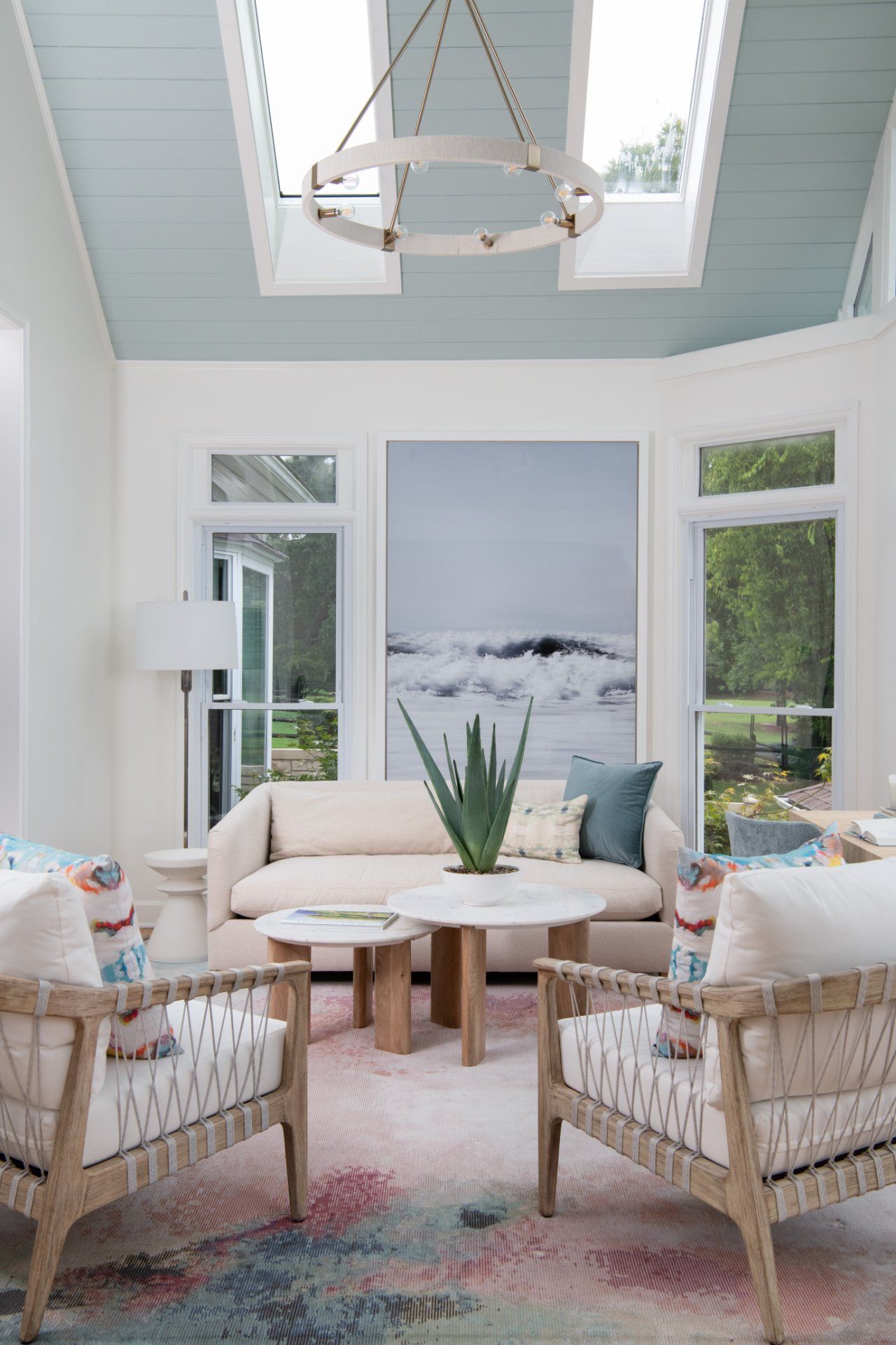
While not identical, ourLight and Bright Project featured a darker, bolder blue for the basement walls, contrasting it with cream-colored furniture to bring the design to life.
The right design elements provide the ideal balance, adding a touch of elegance and uniqueness to this design.
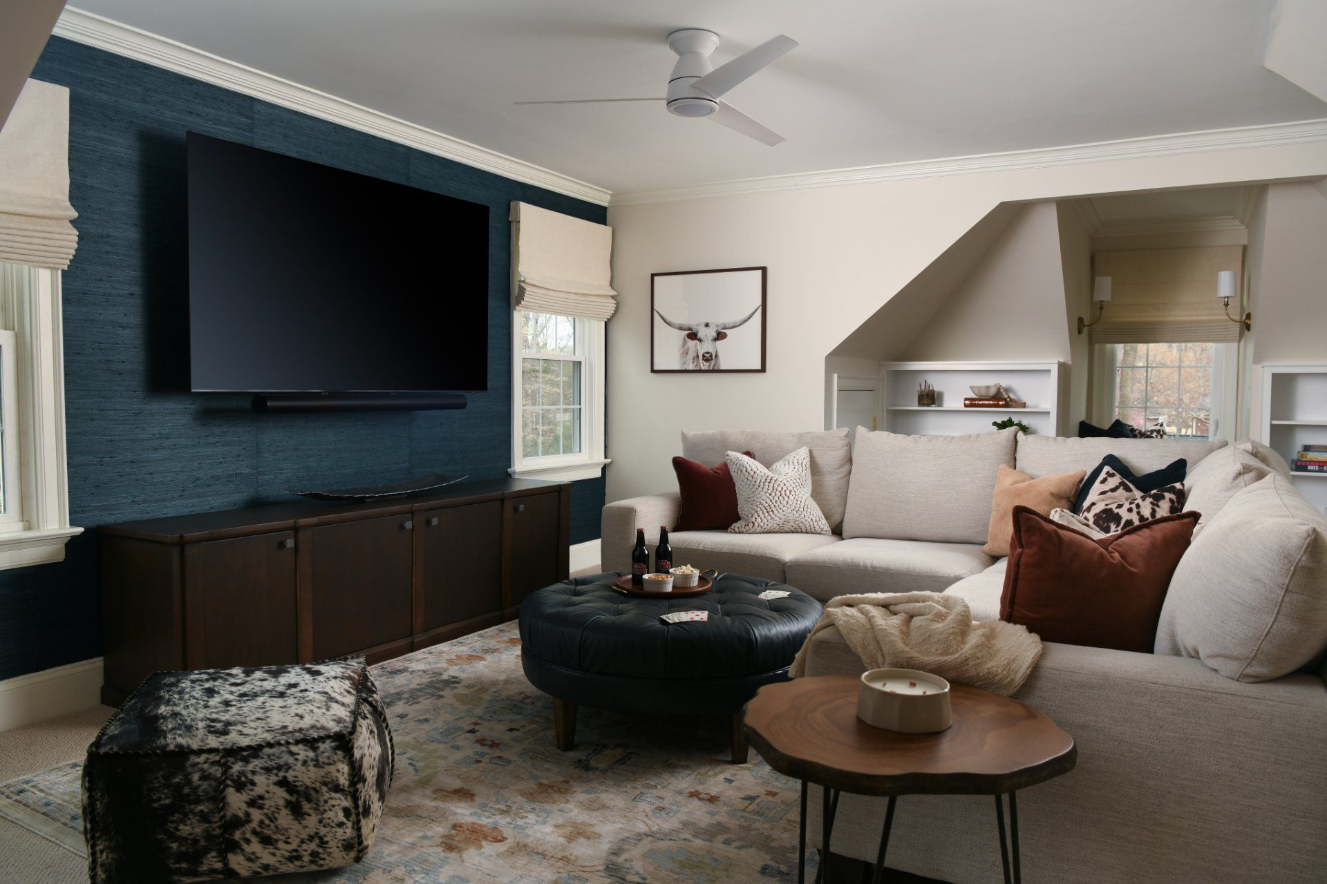
Another example is our
Modern Retreat project. We used a darker gray for the walls and added various elements to balance the room. The sofa makes a statement, and the softness of the drapes balances the room.
What I want you to take away from these examples is that while you may not use the color of the year for your home, don’t be afraid to mix and match colors in your design to create a unique and elevated look.
Best Tips for Using Paint in 2026
One thing is true:
the paint you choose can instantly elevate your space. To help you get started, here are some practical points that can help you choose the right color for your home:
1. Focus on Grounding Colors: If you want your home to feel cozy and elevated, choose warm neutrals and earthy, deeper tones that feel rich and timeless.
2. Use Paint to Create Mood: Paint is basically your personal expression, so focus on how you want to feel when you walk into your home.
- If you’re aiming for calm and peaceful, go for soft blues, warm greens, and neutrals.
- On the other hand, if your goal is for your home to feel cozy and intimate, choose deeper browns, charcoal tones, and rich mid-tones.
- For a bright, energized space, use crisp whites and colorful accents to create a balanced look.
3. Use Warm Neutrals as Your “Base Layer:” 2026 is leaning toward neutrals that have depth and warmth, colors that are tailored and traditional, instead of bland.
4. Paint isn’t Only for Walls: Don’t be afraid to step out of your comfort zone and add personality to unexpected spaces, such as on cabinetry, islands, ceilings, doors, or powder rooms.
Comment below and let us know: are you leaning more towards Universal Khaki or Silhouette?
The best way to create a timeless design is to have a clear goal and understand the feeling you want in your home. Including a professional designer in your project can help bring your vision to life. So, if 2026 is the year you make your dream home a reality, inquire about our services here and let us help your home look personal, cohesive, and cozy.
Remember to pin this article as an inspiration and share it with your friends and family!
What’s your design style?
Find out what kind of interior design best suits your inner self. From Transitional to Modern, it's time to make your home a place you’ll love!
You can opt-out at any time. Please note we do not share your information with anyone.

I work with busy families to create beautiful and functional spaces by providing local design services in the Charlotte/Waxhaw area and beyond through online design.

What’s your design style?
Find out what kind of interior design best suits your inner self. From Transitional to Modern, it's time to make your home a place you’ll love!
You can opt-out at any time. Please note we do not share your information with anyone.

Recent Posts