Today I am sharing with you my top 5 neutral paint colors by Sherwin Williams. I have either used these in my own home or recommended to clients. If you like a warm, neutral gray that will work with almost anything, then these are your go-to paint colors.
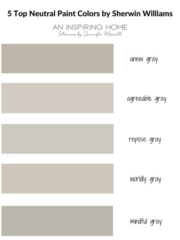
ANEW GRAY
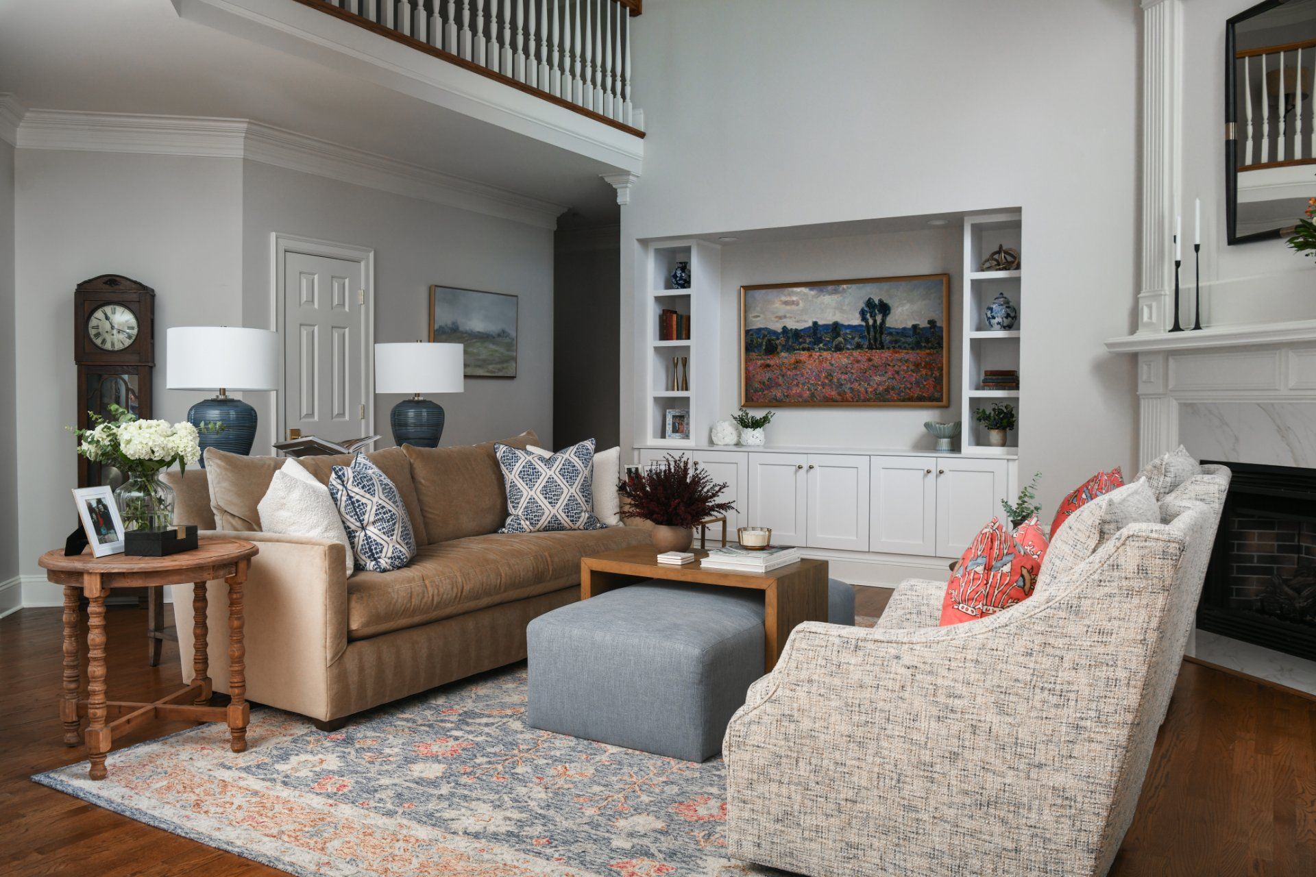
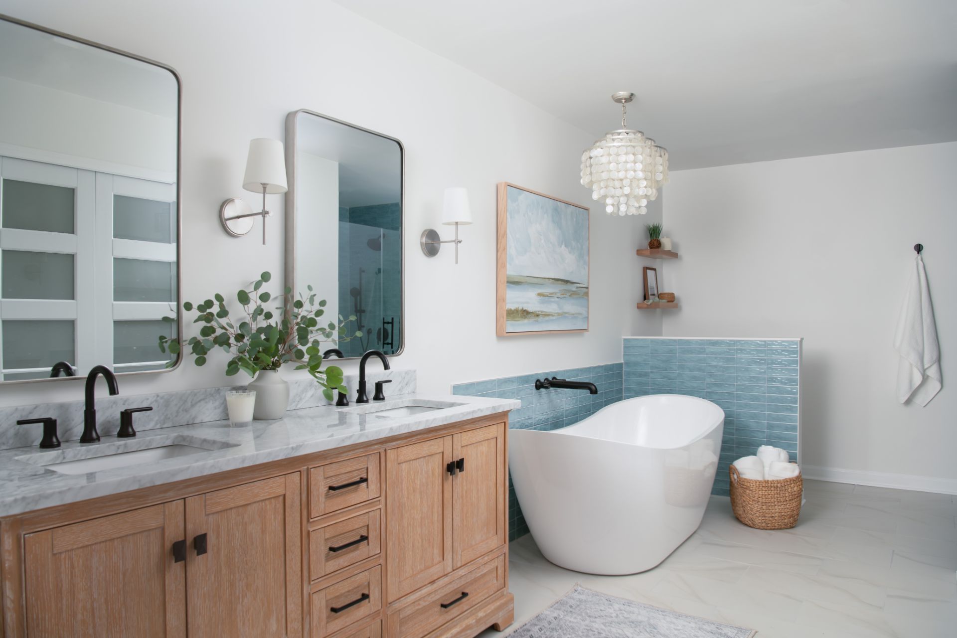
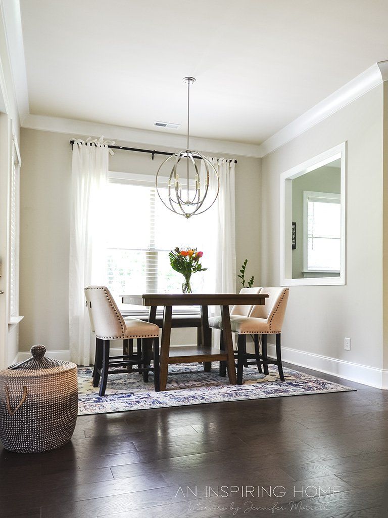
Anew gray is a color I have throughout the main areas of my home. My home is an open 2-story layout that gets tons of natural light. Anew gray is a mid-tone shade and works really well here without any undertones showing through. You might consider it a greige. It’s the perfect backdrop for pops of teal and aqua.
See more anew gray in this client’s kitchen and living room.
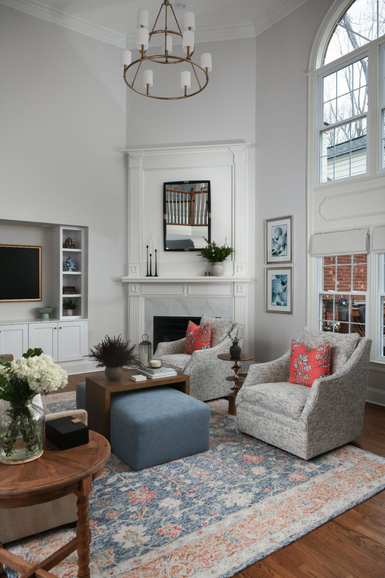
AGREEABLE GRAY
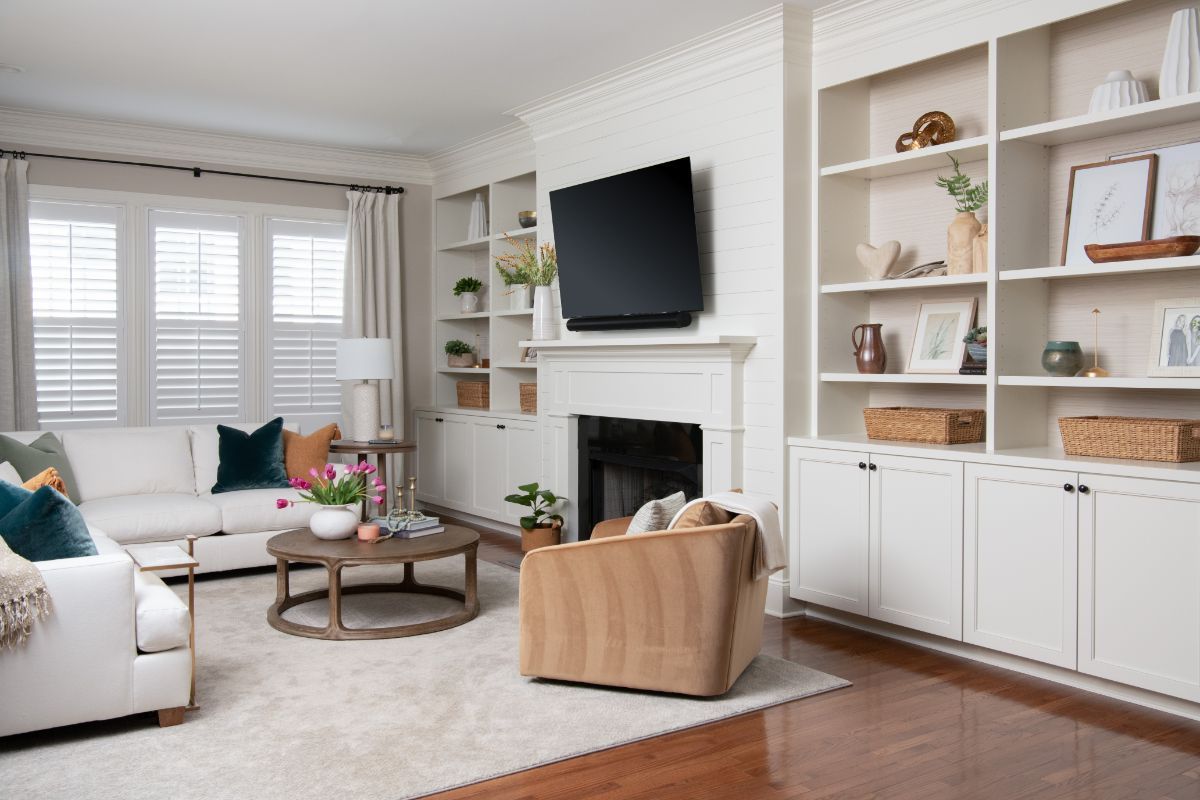
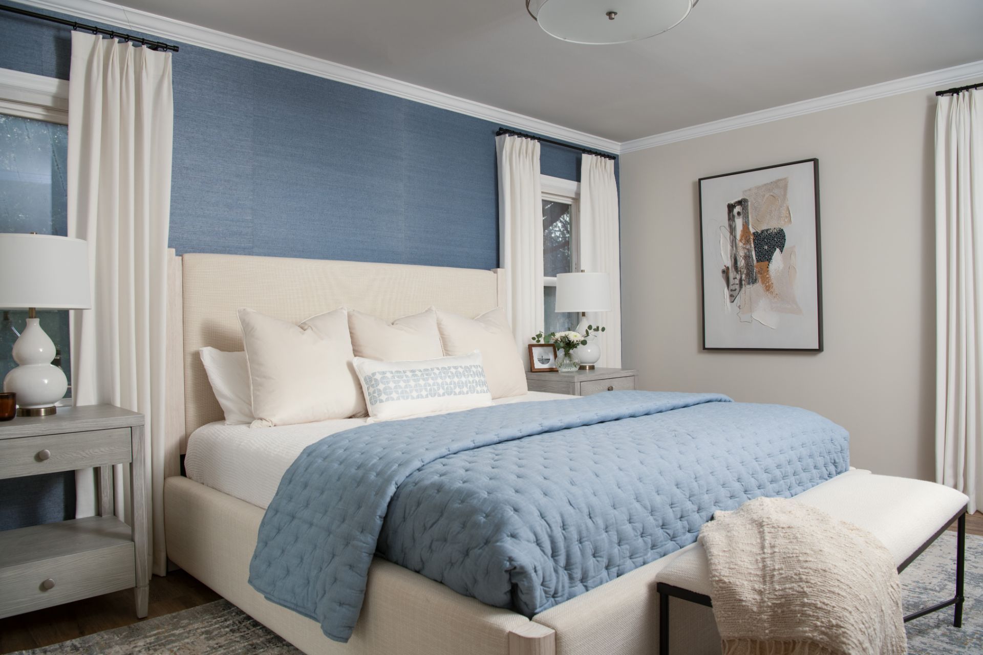
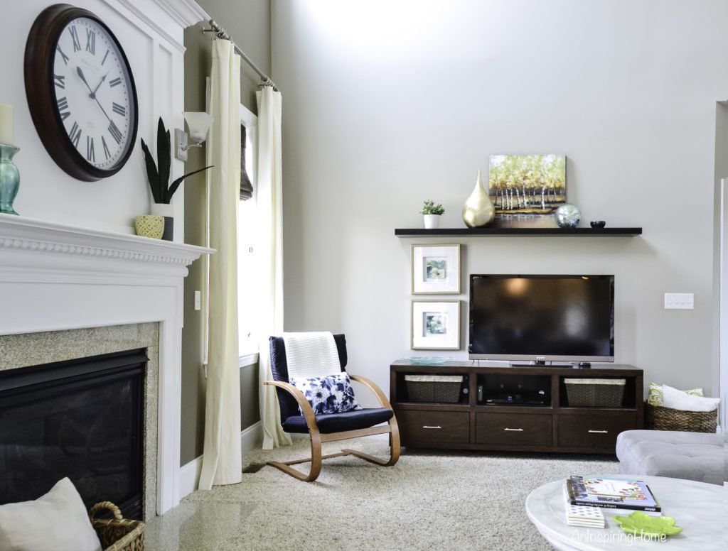
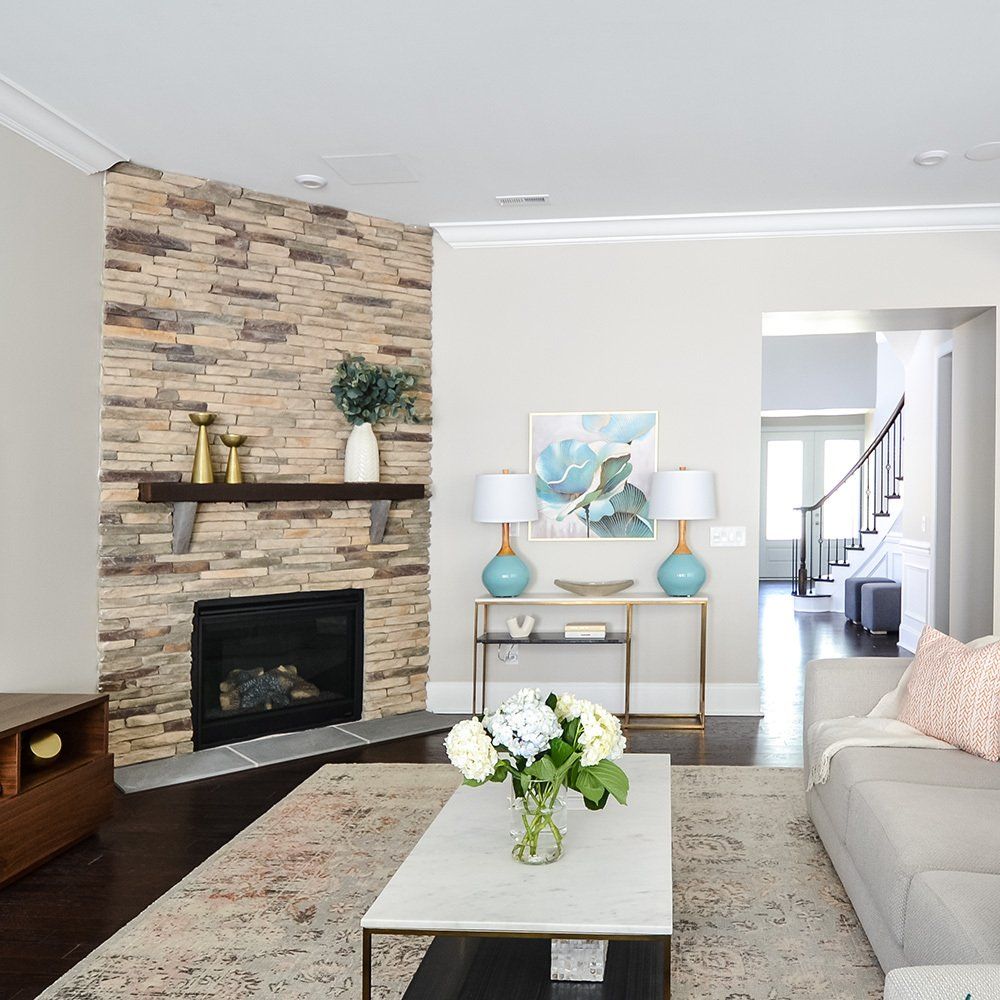
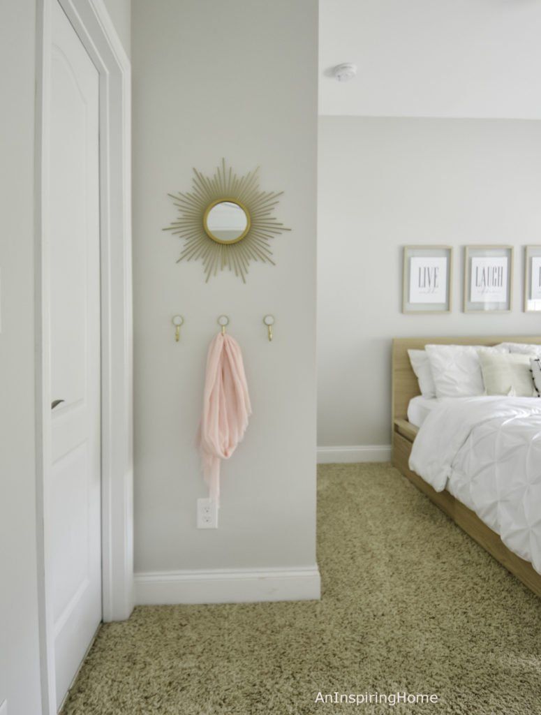
Agreeable gray is painted on the walls in my bedroom. It’s a bit lighter in color with less brown than Anew and pairs really well with charcoal gray and pops of navy and bright pink.
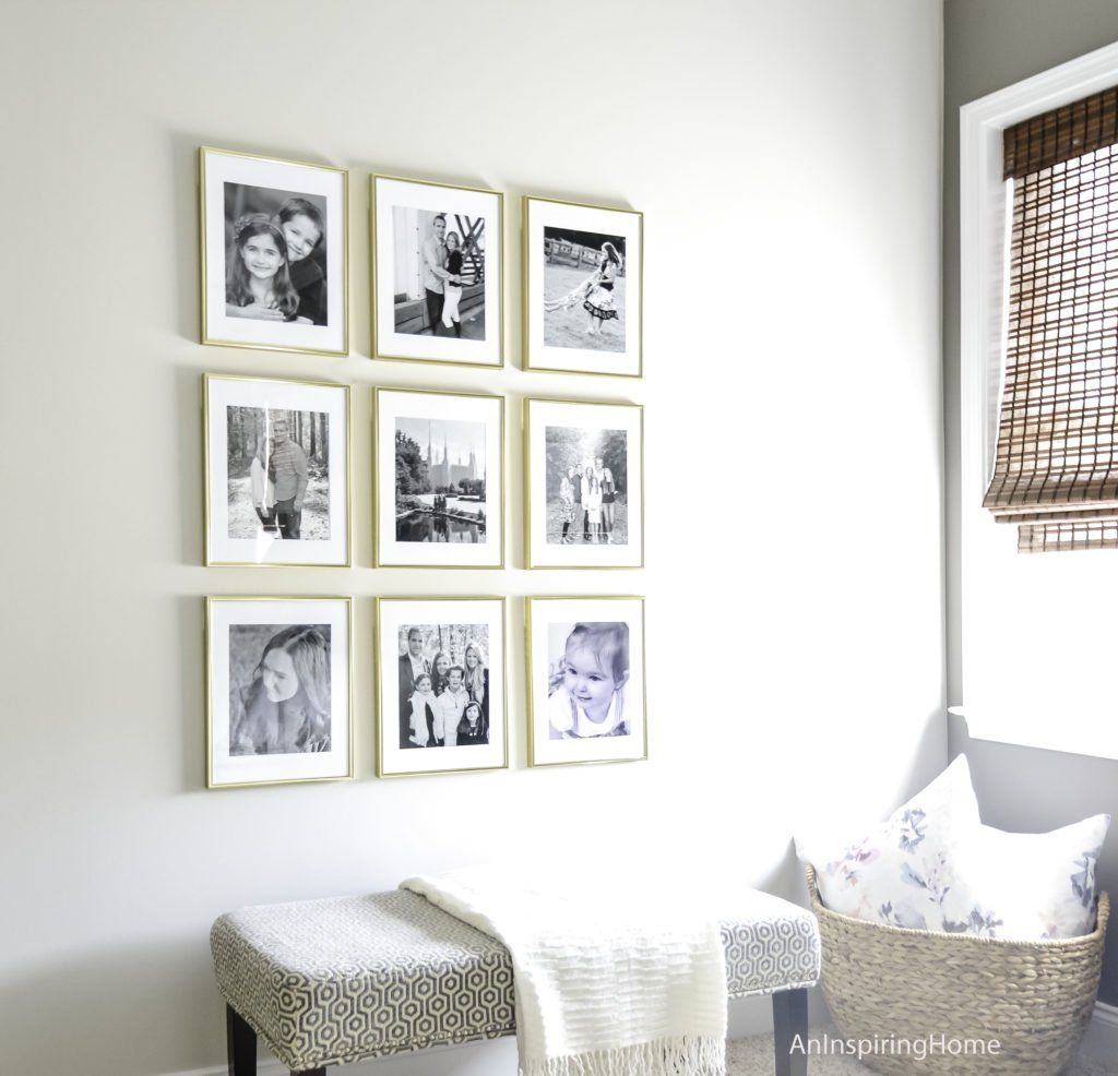
Read more on this gallery wall.
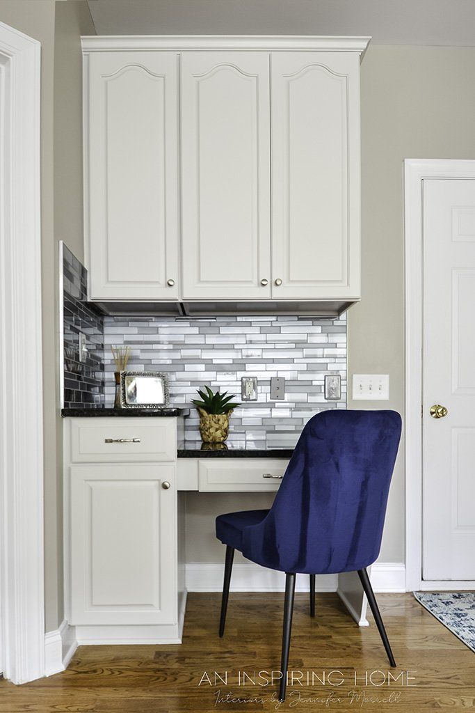
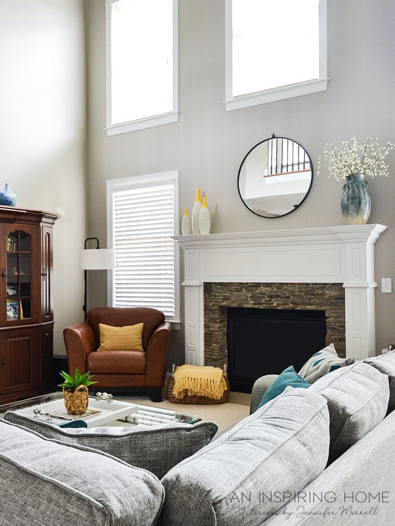
See more of this client’s living room and breakfast nook painted agreeable gray.
REPOSE GRAY
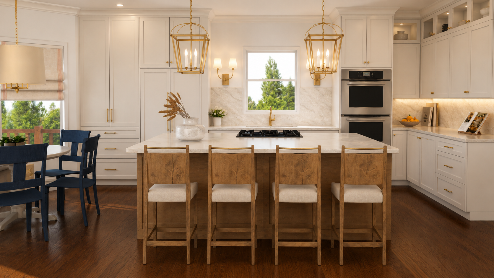
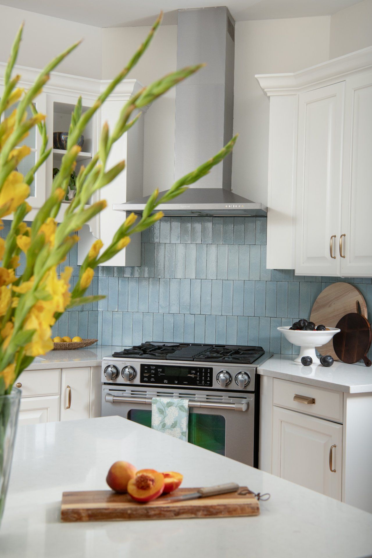
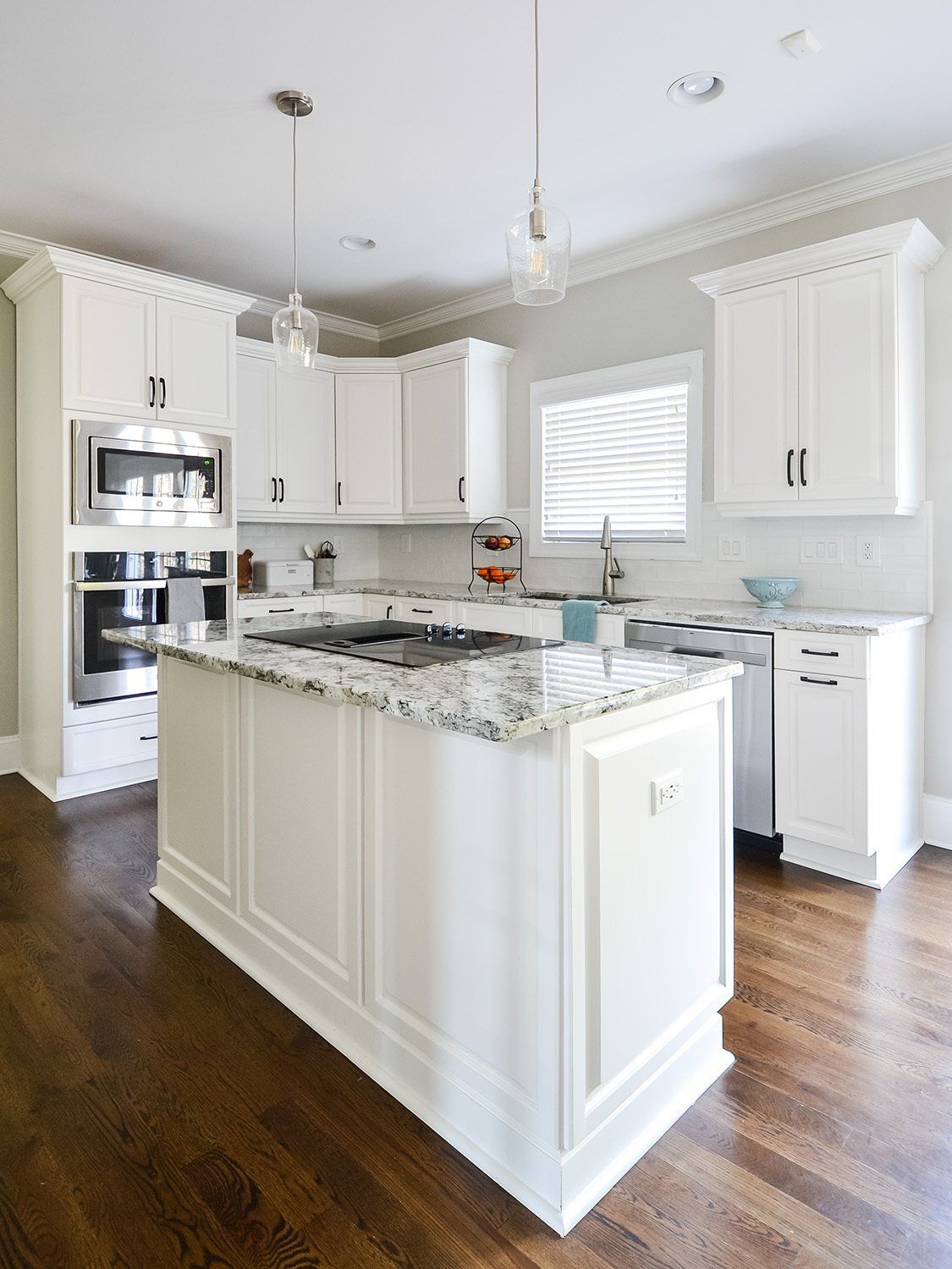
Repose gray is a lovely cool gray, however, be aware of the undertones. Sometimes, Repose can read a little purple or blue depending on the natural light in the room. I'm loving in this client's kitchen paired with Snowbound on the cabinets.
WORLDLY GRAY
Worldly gray – I’ve used this in a client’s office and another client’s bedroom. It’s a beautiful, warm shade and looks great with natural wood tones. You can see it throughout this client's home.
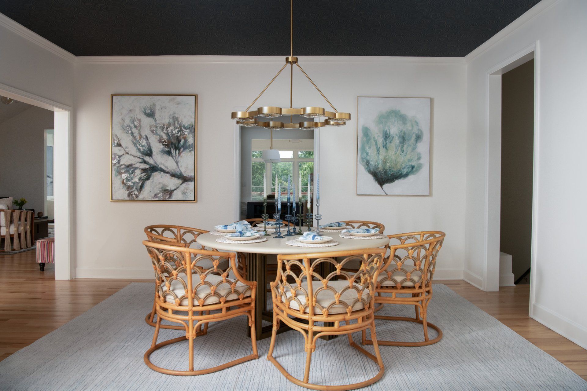
MINDFUL GRAY
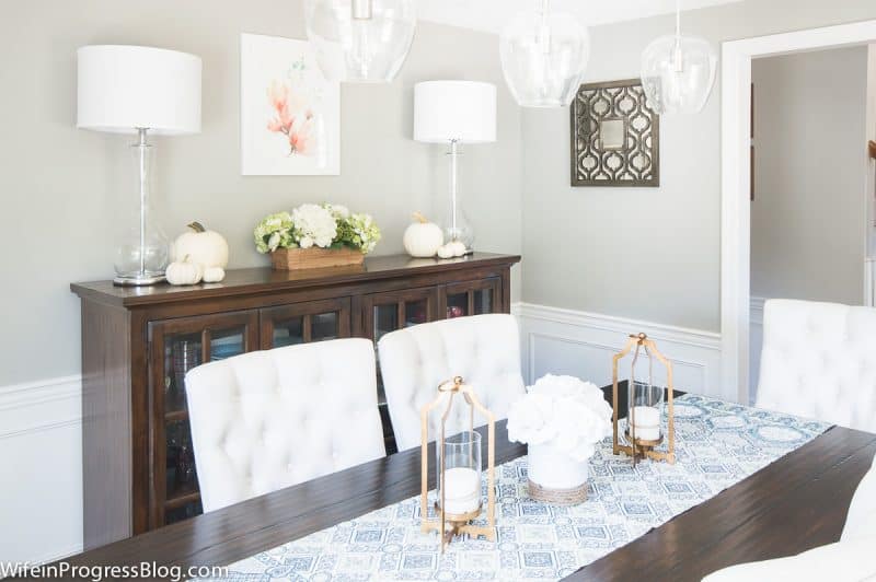
Mindful gray – I love how Jenna used Mindful in her dining room. It’s a wonderful mid-tone color, and it will work in most rooms. It can have a green undertone, but it will reflect light nicely. It’s also a great color for kitchen cabinets or built-ins if you want something other than white.
I love a neutral color palette, and here are some reasons why. It’s easier to bring in pops of color with furnishings and accessories. Neutrals are soothing, easier to live with and are timeless. A neutral color palette doesn’t have to be boring as long as you are adding layers of texture.
TIPS FOR CHOOSING A PAINT COLOR
1. Find a piece of art or a rug or anything you want to use in the room you are painting and pull your color from that.
2. Gather a color strip of each color you’re considering and observe them in your home. Eliminate the ones you don’t want. Some colors might appear too cool while others might read a different color entirely.
Sherwin Williams lets you order 2″x3″ samples to have delivered to your door. Narrow your choices down to 3.
3. Buy a sample (or 2 or 3) and test in your home. I cannot stress this enough. Test a large sample on something white in the room you want to paint and live with it for a couple of days. Notice how the lighting affects it throughout the day, and look for any undertones. Test the paint in the middle of a piece of poster board or foam core so the current wall color doesn’t influence your sample.
4. Try lightening the color by 25% or 50% if the undertones are showing too much. You can see this room is painted Repose Gray at 50% because it was reading too blue at 100%.
Read more about this teen bedroom makeover.
Whether you are looking to paint a room or your entire house, you cannot go wrong with these 5 neutral paint colors. They are my go-to warm, neutral gray colors.
PIN IT!
What’s your design style?
Find out what kind of interior design best suits your inner self. From Transitional to Modern, it's time to make your home a place you’ll love!
You can opt-out at any time. Please note we do not share your information with anyone.

I work with busy families to create beautiful and functional spaces by providing local design services in the Charlotte/Waxhaw area and beyond through online design.

What’s your design style?
Find out what kind of interior design best suits your inner self. From Transitional to Modern, it's time to make your home a place you’ll love!
You can opt-out at any time. Please note we do not share your information with anyone.

Recent Posts